

We are a branding and content agency helping bold marketers build brands, stories, and experiences that connect and endure in a scroll-fast, AI-first world.
Why Us
We move ideas forward. By reimagining how brands look, sound, and behave, we spark new energy and open space for evolution.
We create ideas that move people and performance. From brand platforms to campaigns and content, every piece works to connect and deliver results.
We move fast and stay meticulous. Our model delivers the craft of a boutique studio with the reach and efficiency of a full-scale partner.

What We Do
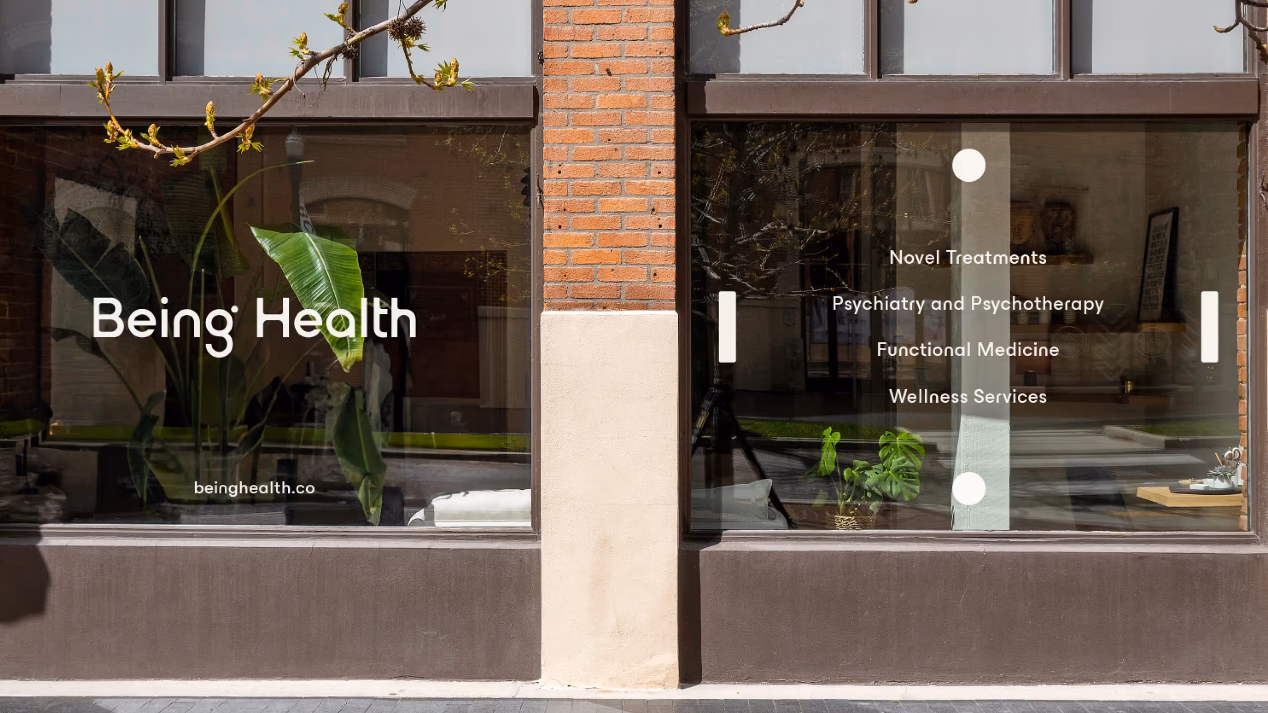
Whether it’s positioning, visual identity, content, or experiences, we help brands launch, grow, and evolve with focus and distinction.


In-house, in motion
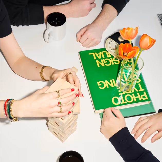
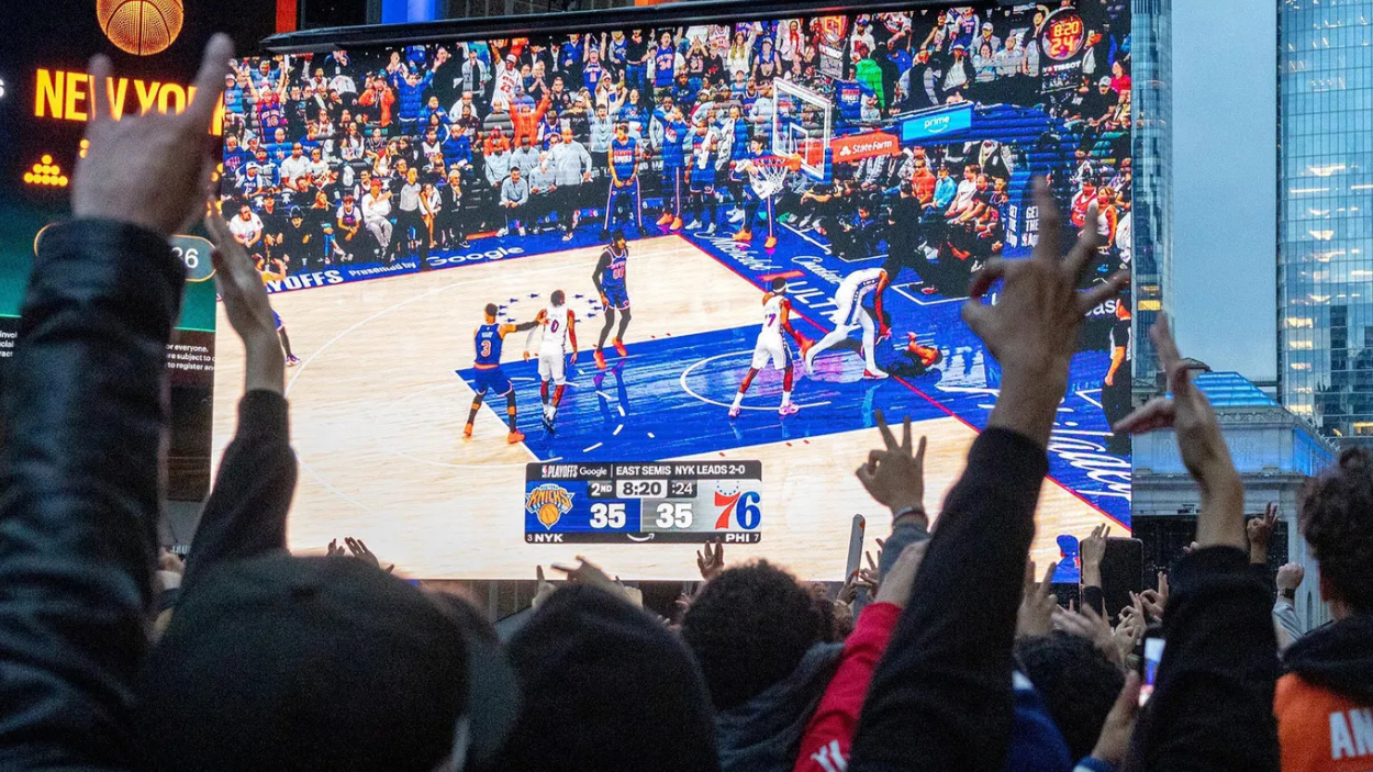
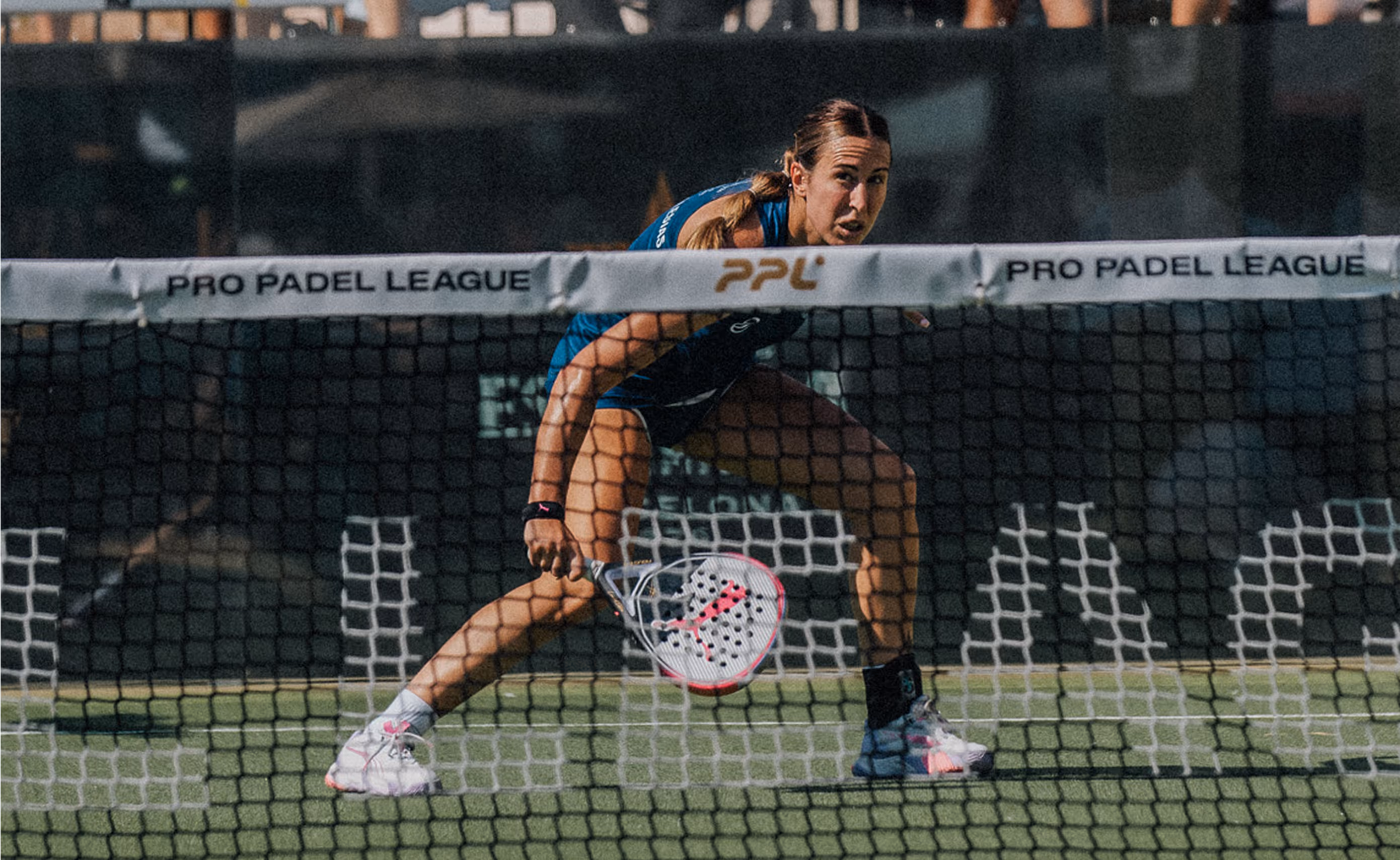
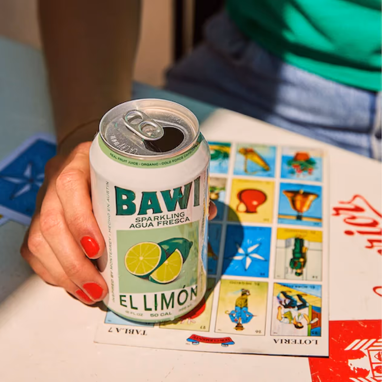
Our production studio in Manhattan turns creative concepts into content that moves. We combine hands-on craft in photography and video with purposeful AI tools to streamline workflows, scale output, and maintain the quality and control every brand deserves. Full editing and animation team to help your brands create social campaigns, or e-commerce images, or whatever you need.
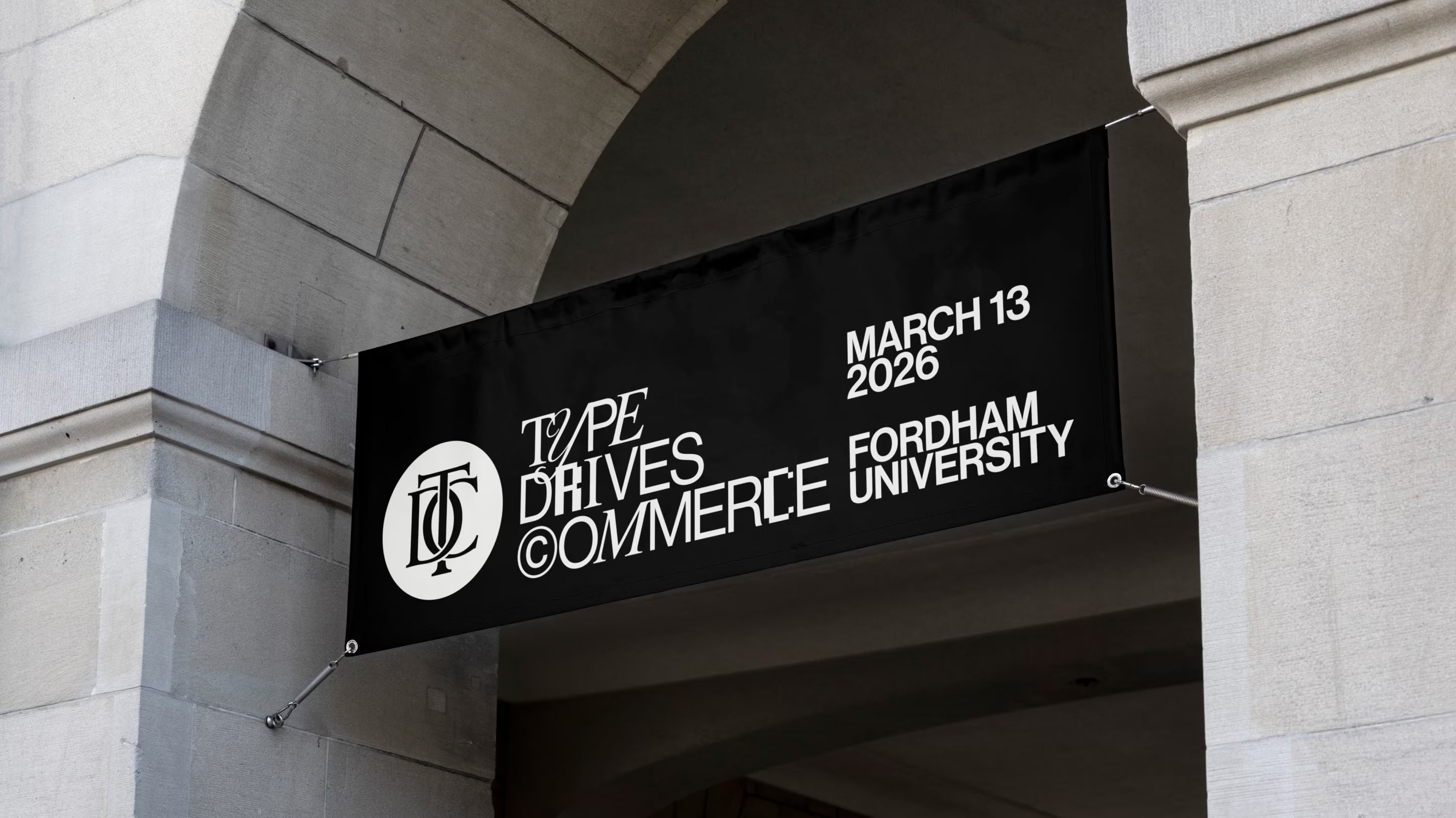
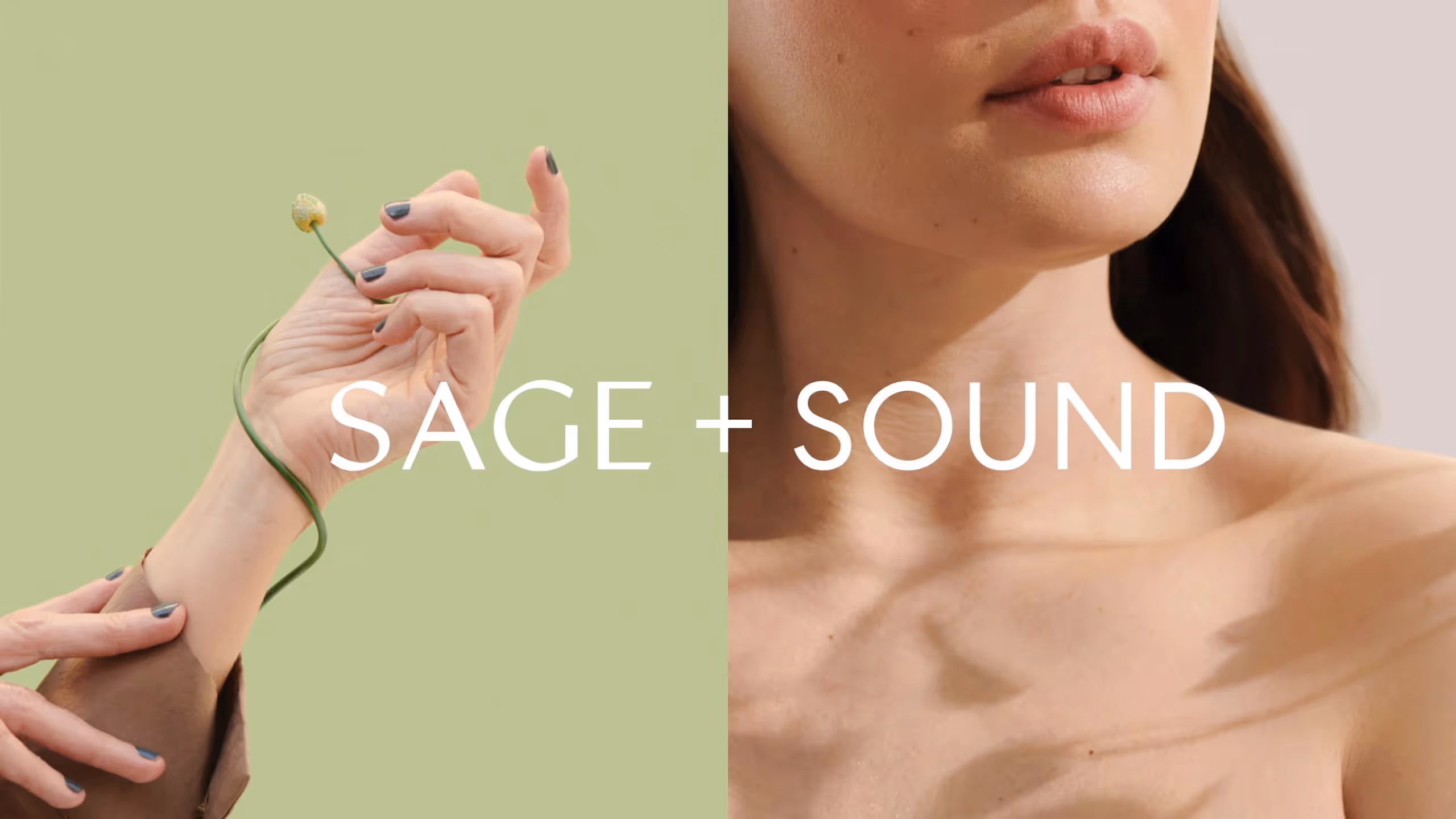
works
works


How do we know our work, works? The numbers speak for themselves.
458 clients
328 distinctive brands
$795M in funding
Work with Us
Have a project in mind? Let’s connect.