Being Health
Development of a funding pitch and brand identity system for a modern comprehensive psychiatric clinic.
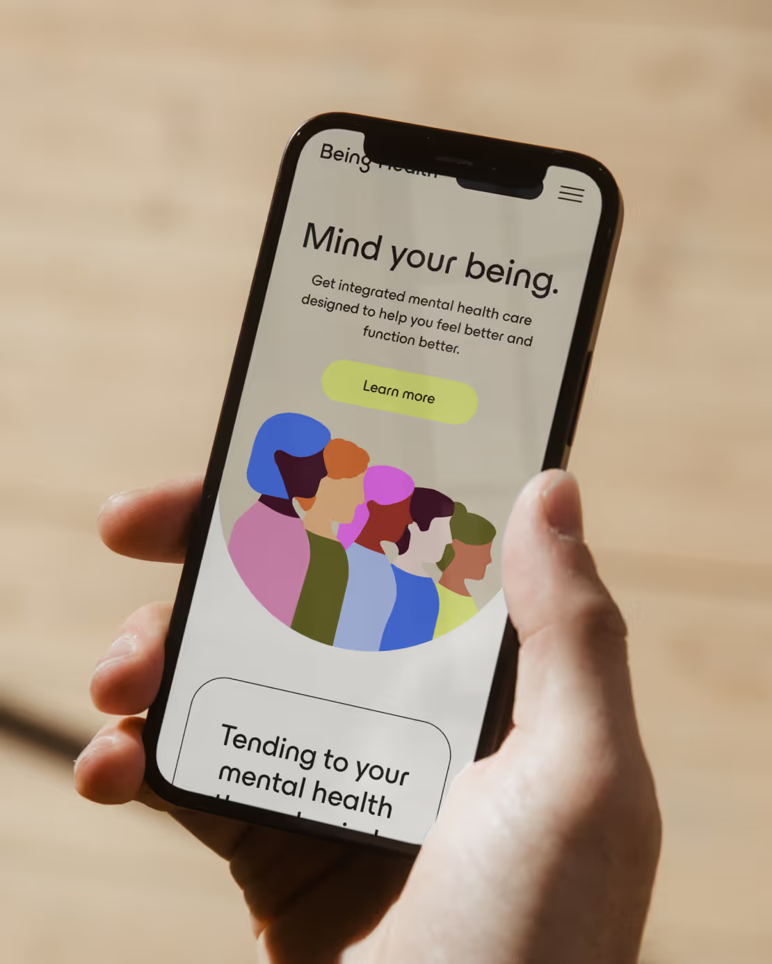
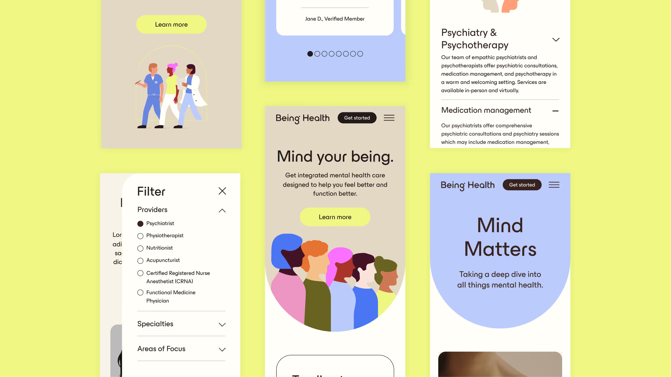
Being Health is a mental health clinic that provides its patients with novel, individualized and comprehensive treatment. Founded by Dr. Allie Sharma, a Cornell-trained board-certified adult psychiatrist, Being Health aims to make finding and receiving mental health care approachable, comprehensive, and innovative. The Working Assembly partnered with Being Health to create a dynamic pitch that in turn earned them $5.4 million in funding from top investment and venture capital companies. From there, we helped Being Health create its brand from the ground up, including brand strategy, visual identity, and verbal identity.
What We Did:




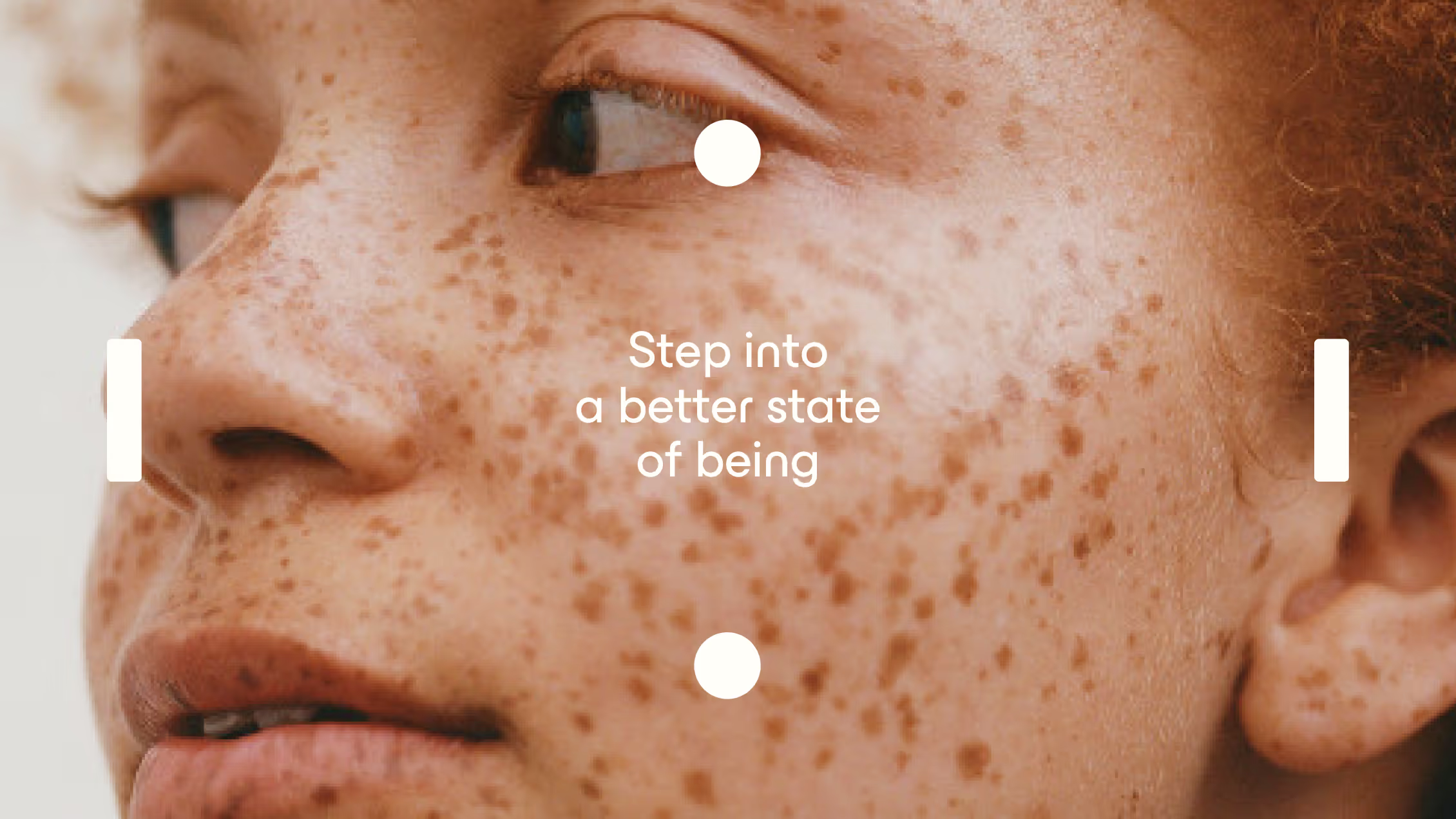
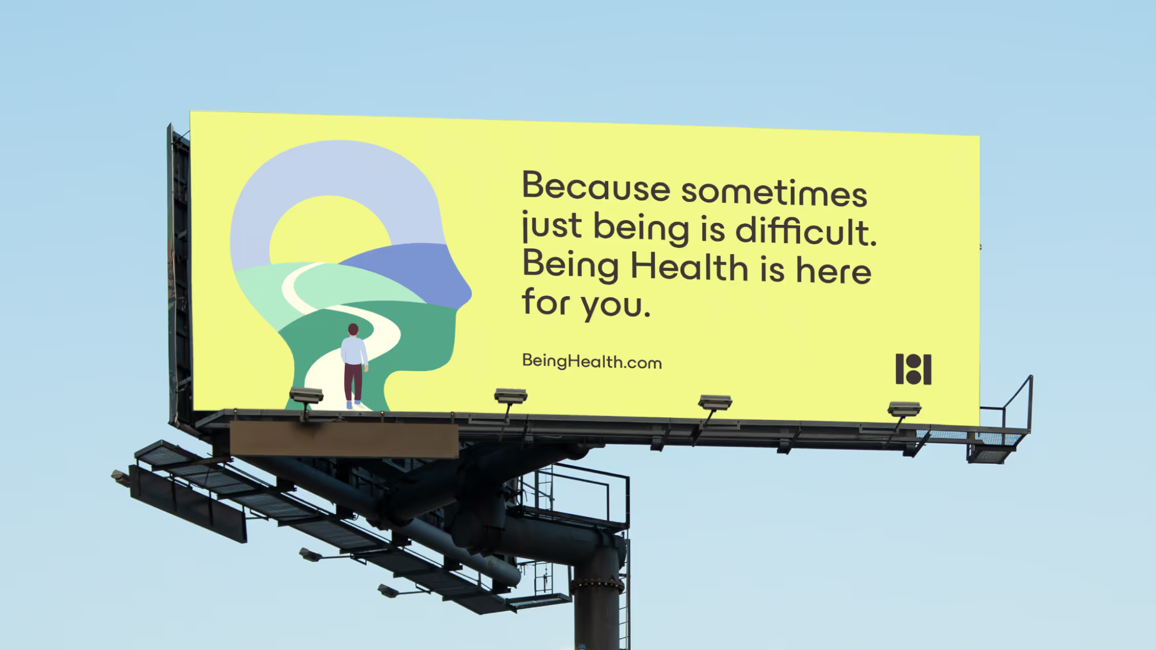
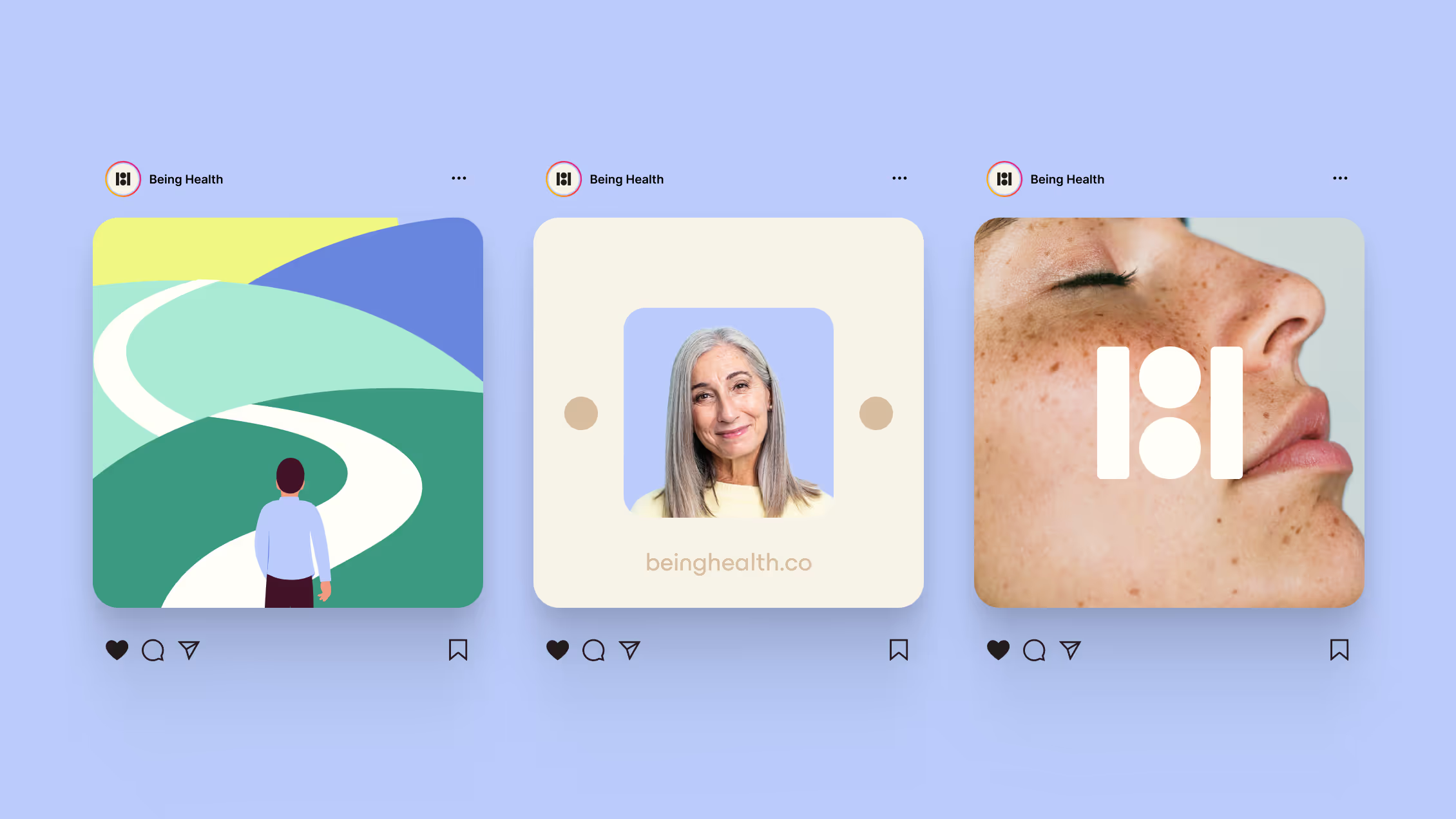
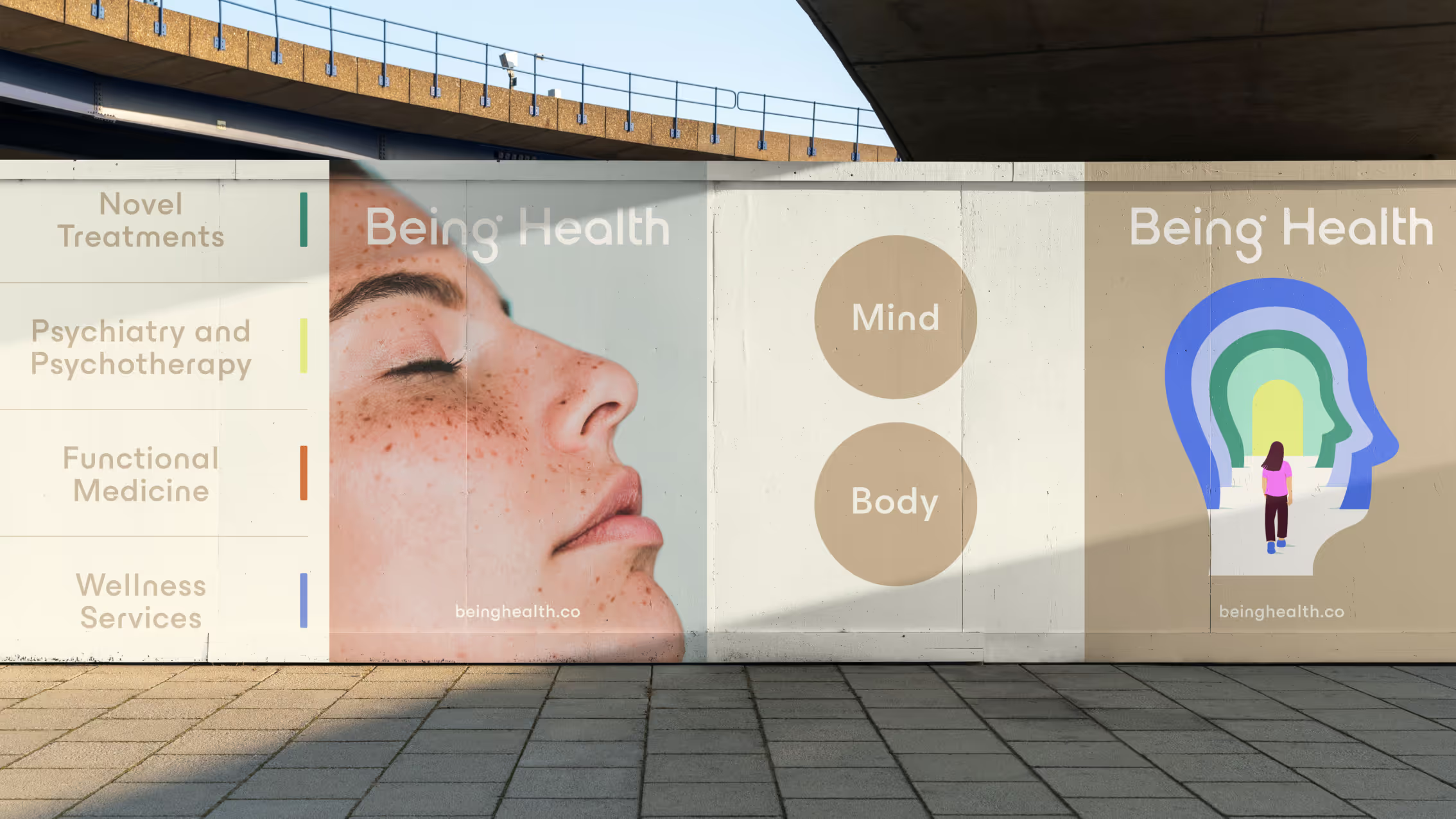
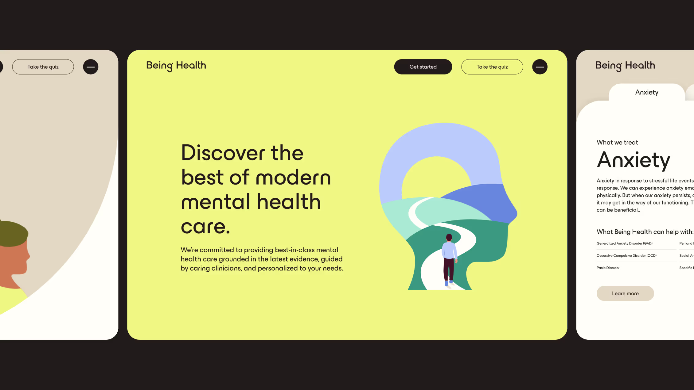
Visually, we kept iconography light, with illustrations that show humans paving their own paths, whether it be climbing ladders, building stairs, or creating windows to walk through. This depicts the individualized and comprehensive care that each patient receives. A key aspect of some of these illustrations is the head-shaped window we see them through, signifying the internal journey that is mental health care.

