MassMutual
A modernized brand system for a mutual insurer with 170+ years of experience.
One of the oldest life insurance and financial services companies in the U.S., MassMutual serves individuals and businesses with retirement, investment, and protection solutions. But, as a 170-year-old legacy player, MassMutual needed to modernize its brand to resonate with its B2B partners and digital-first generations who distrusted traditional financial institutions.
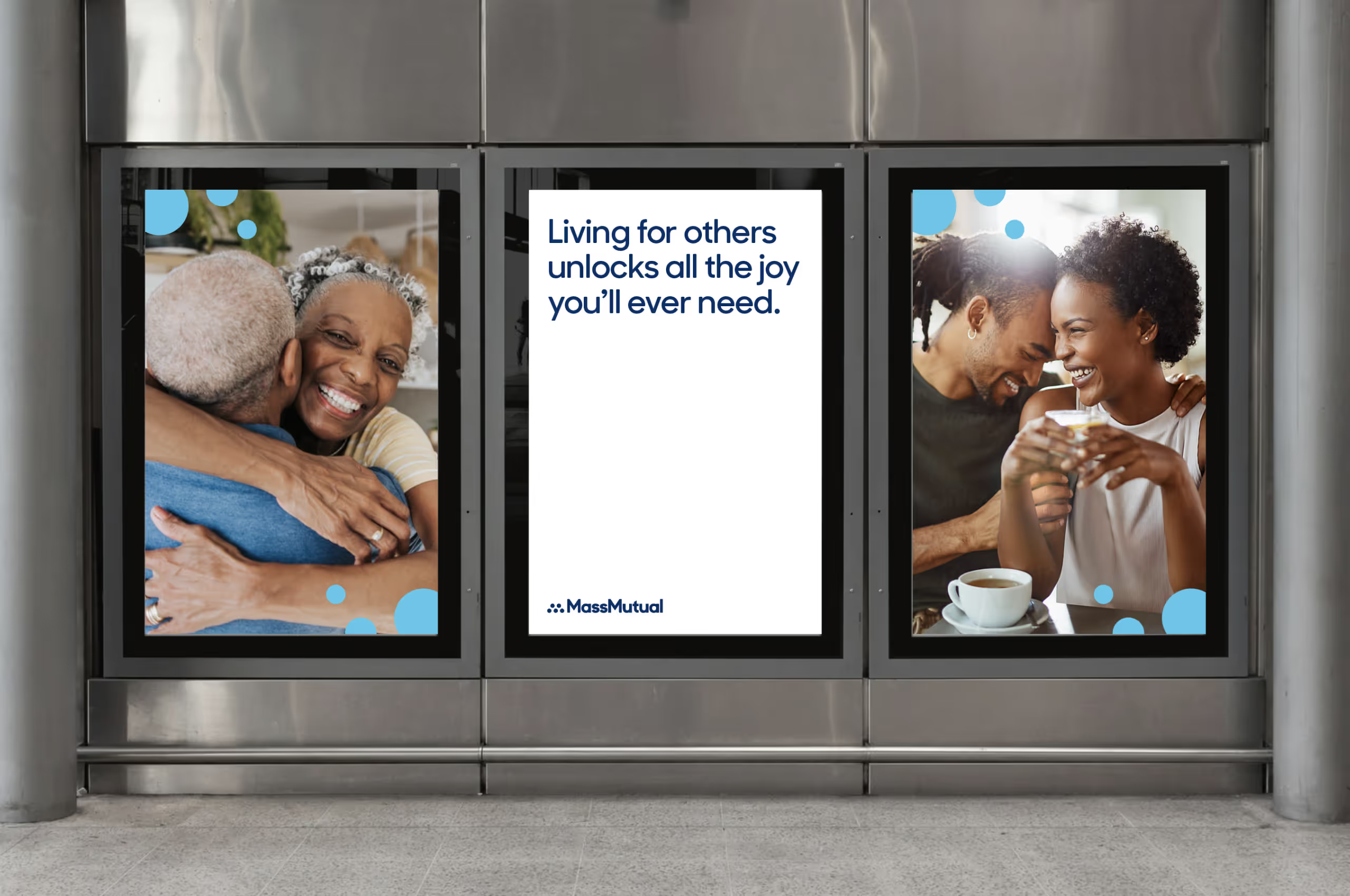
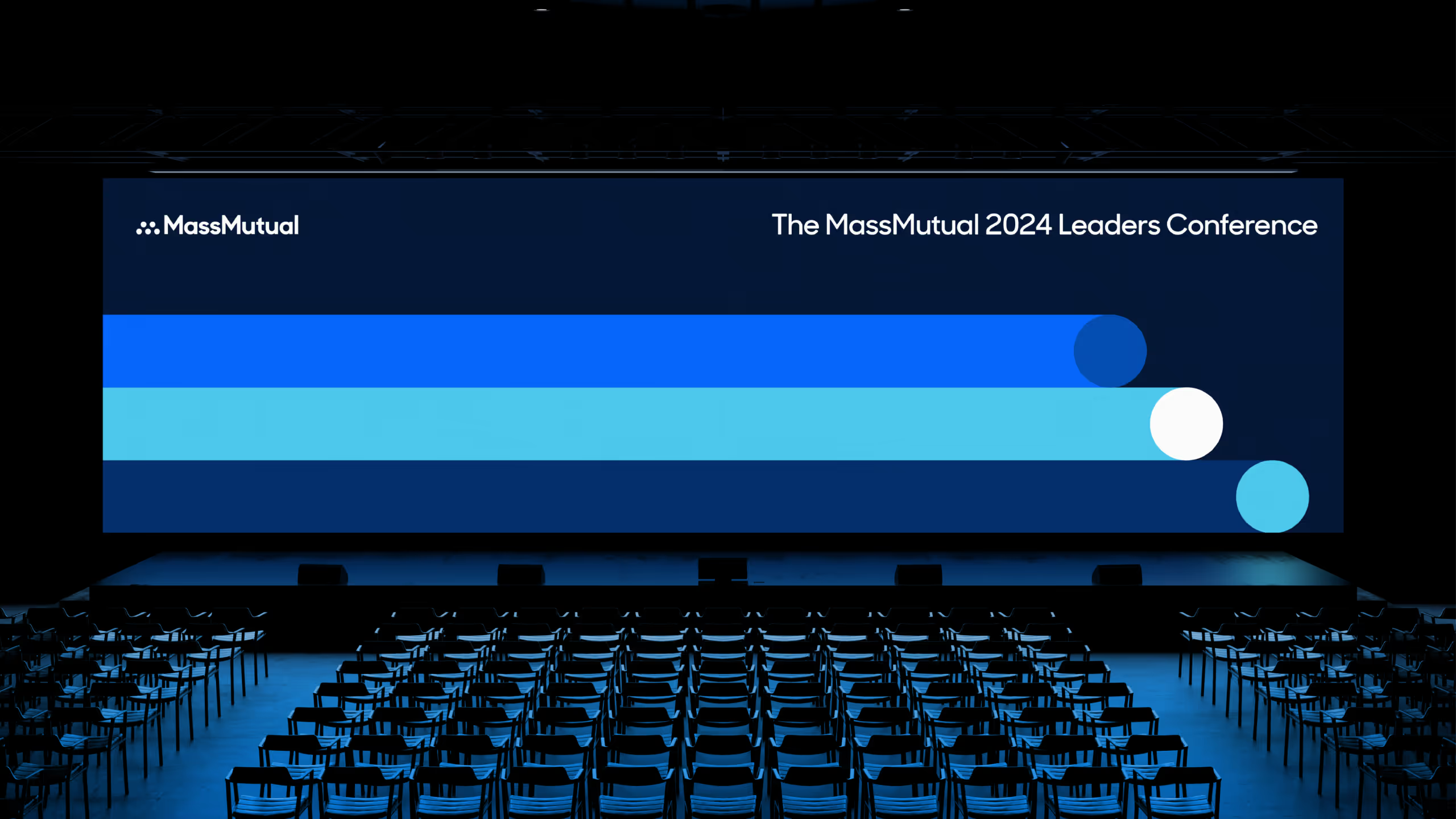
We developed a new brand identity system, built around themes of mutuality, protection, and service, and launched the “Live Mutual” brand platform to spotlight the power of collective support in achieving financial well-being. Alongside the brand toolkit, we delivered foundational social assets and campaign templates, giving MassMutual the ability to translate its refreshed identity seamlessly from print to digital and show up with energy across their social channels.
What We Did:


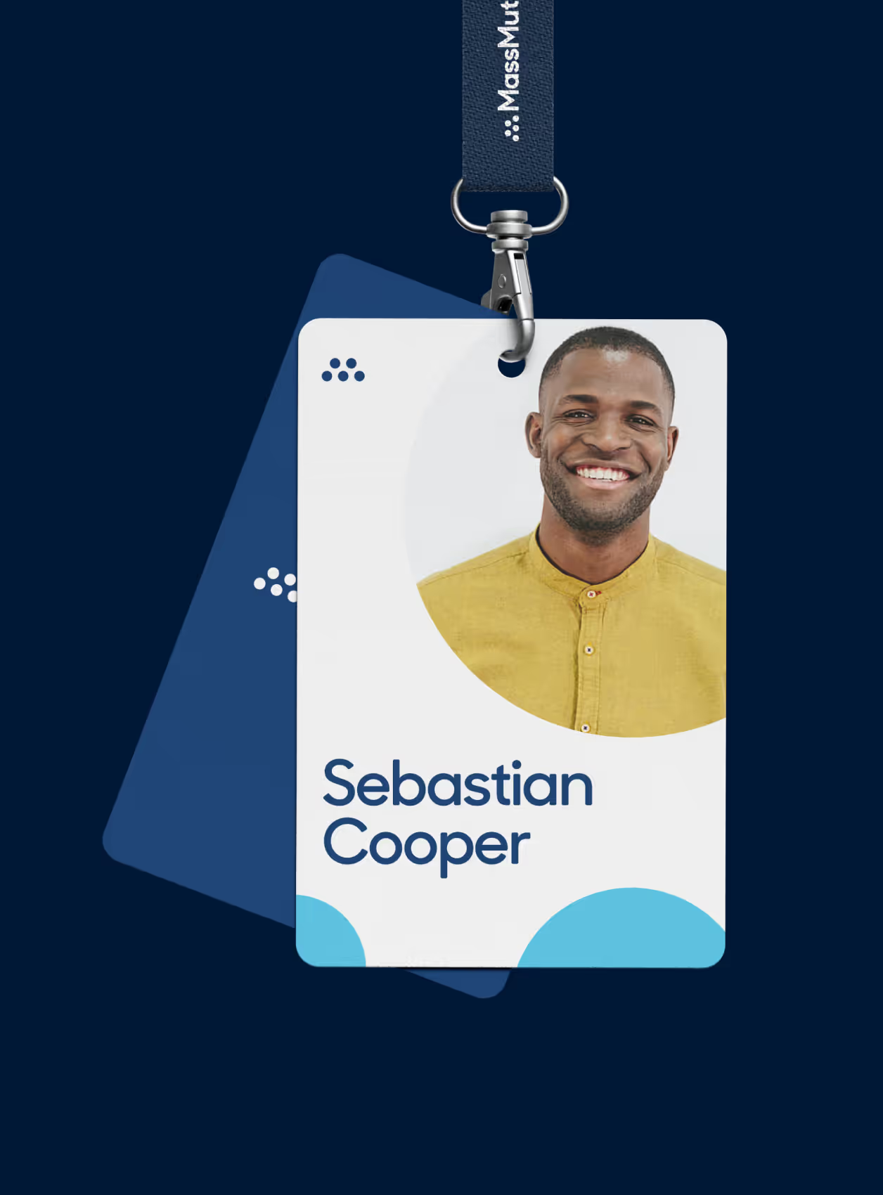
The new MassMutual logo inspires solidarity and cooperation. The dots represent people from communities large and small coming together to secure their future and protect the people who matter the most. The carefully rounded corners of the wordmark are approachable and beautiful—humanizing our company and forging connections with our audiences.
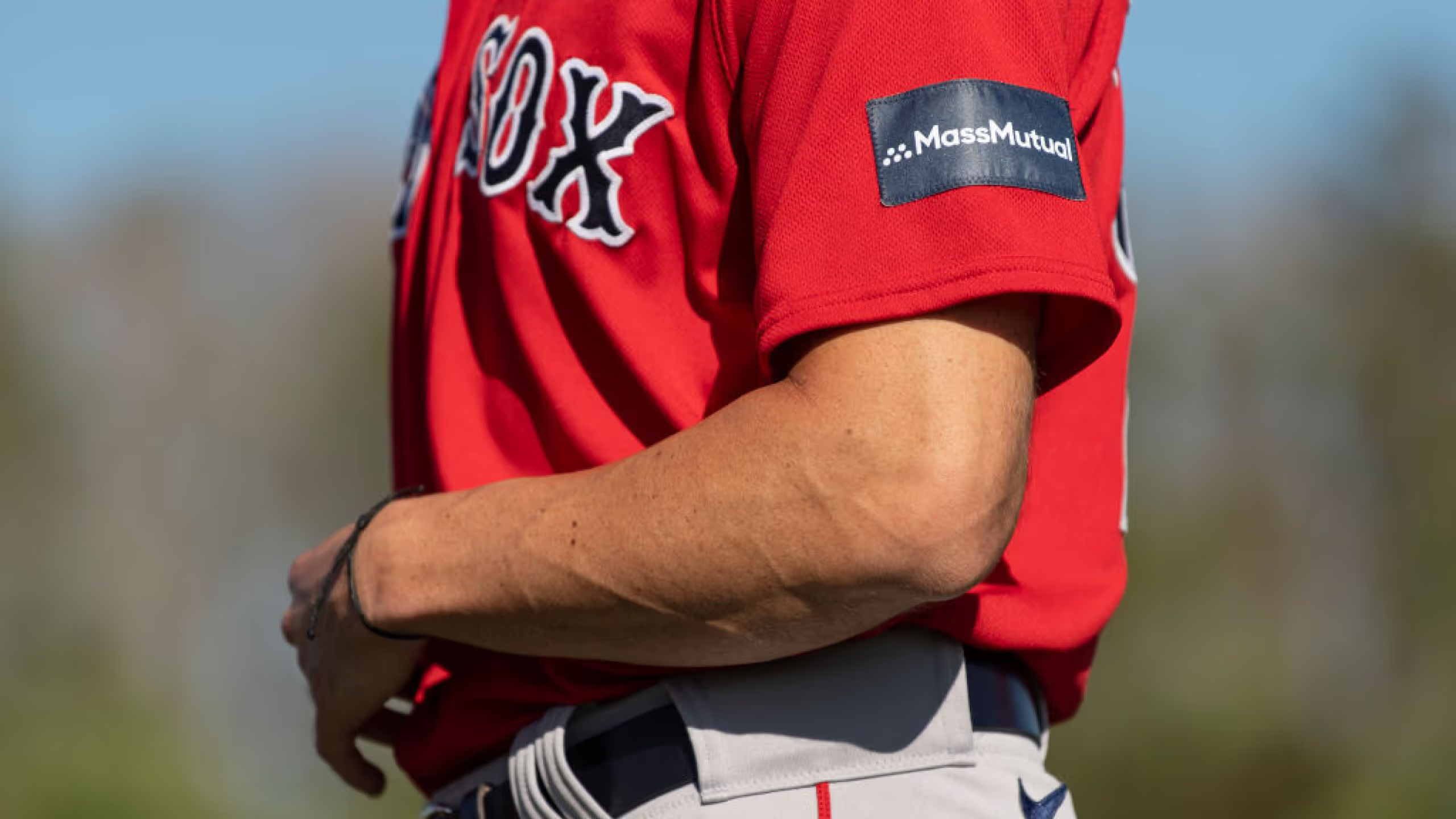


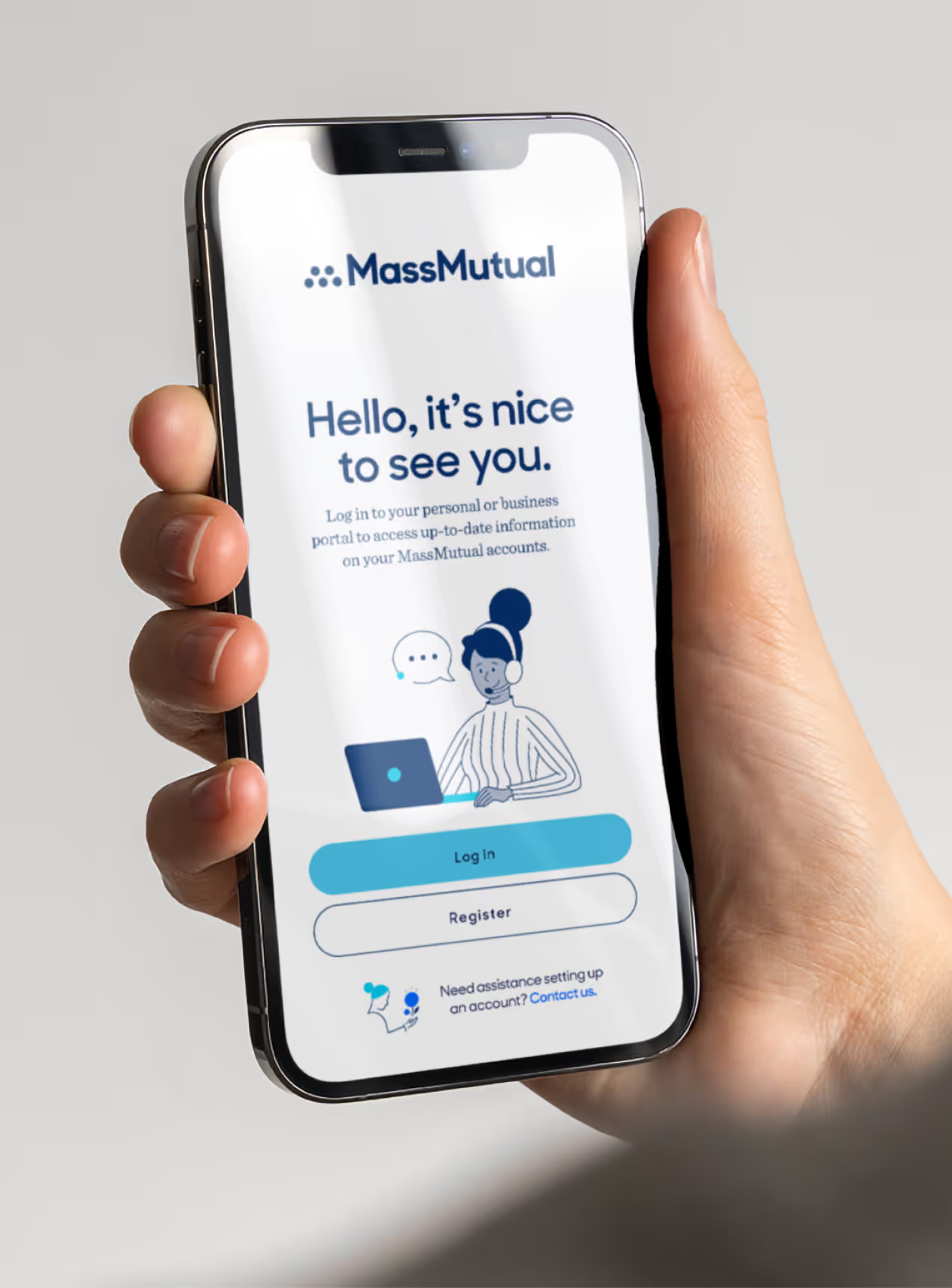
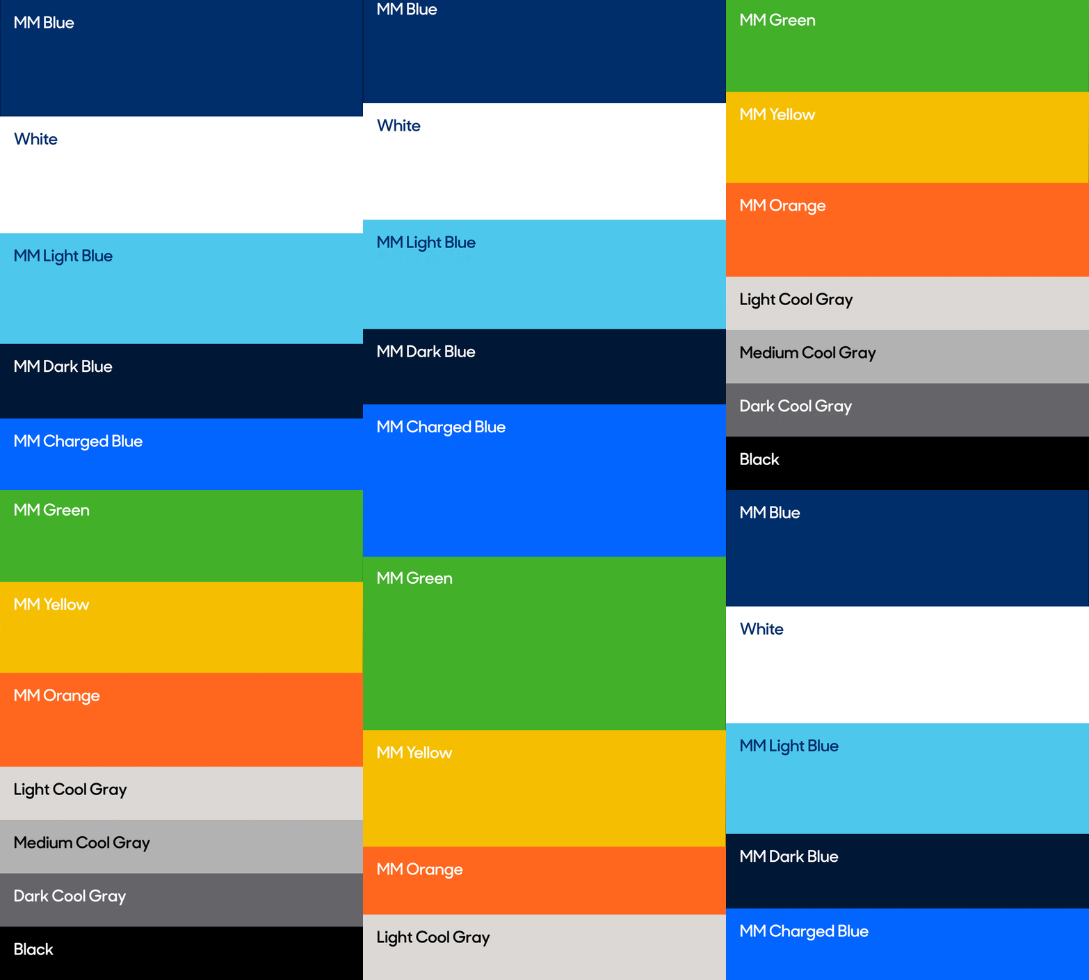




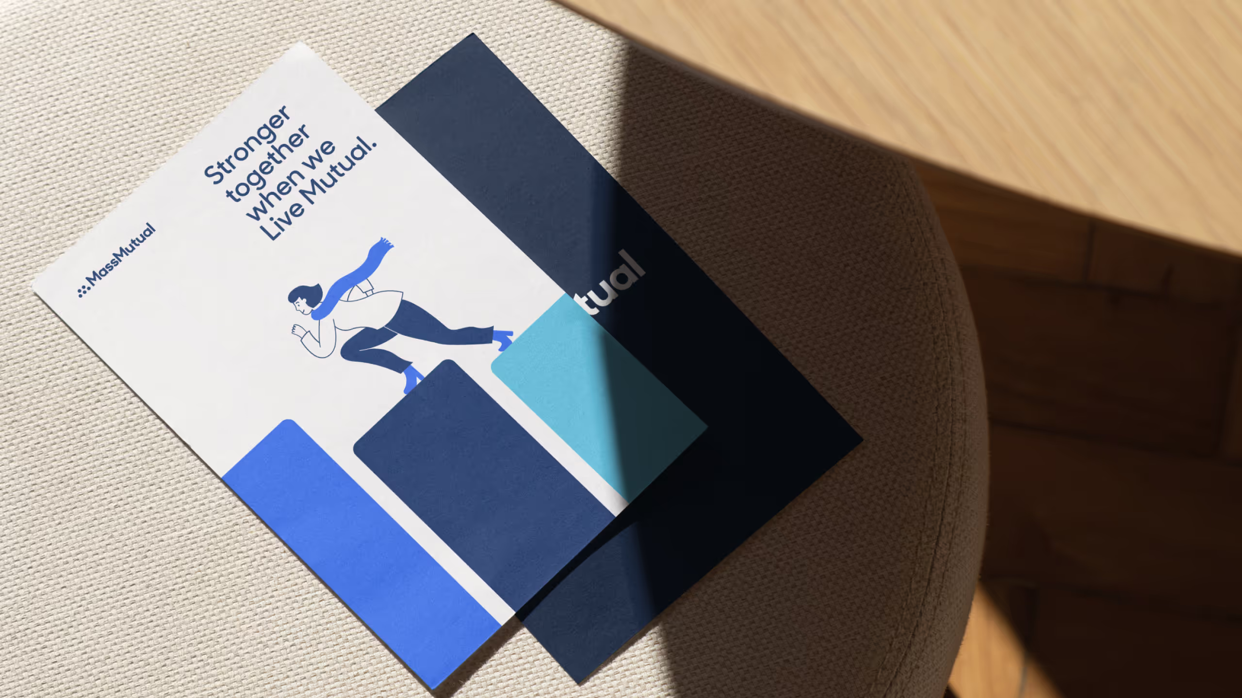
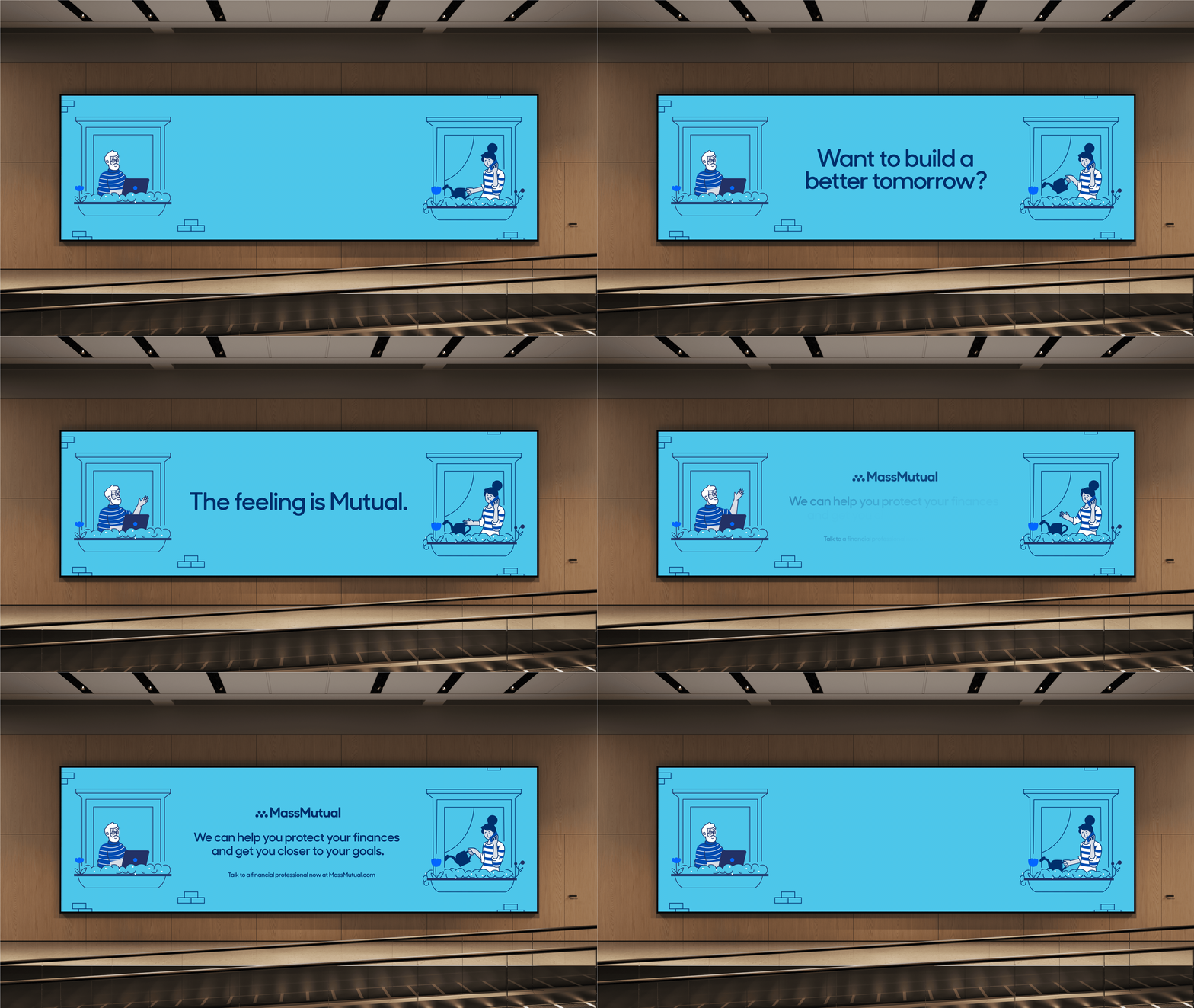
Our illustrations are organized across a range of four tiers. Each tier is created to address specific ideas, usage, and scale to create a comprehensive, cohesive, and versatile toolkit. This allows us to translate seamlessly from print to digital channels.




Our icons are simple in detail, monolinear, and include a highlighted dot that “creates” the pathway along the outside of the icon. This pathway should always sit on open spaces in the icon, ideally on a natural edge or break.



Results
50%
Lorem ipsum dolor sit amet, consectetur adipiscing elit, sed do eiusmod tempor inci didunt ut labore et dolore magna aliqua.
50%
Lorem ipsum dolor sit amet, consectetur adipiscing elit, sed do eiusmod tempor inci didunt ut labore et dolore magna aliqua.
50%
Lorem ipsum dolor sit amet, consectetur adipiscing elit, sed do eiusmod tempor inci didunt ut labore et dolore magna aliqua.

