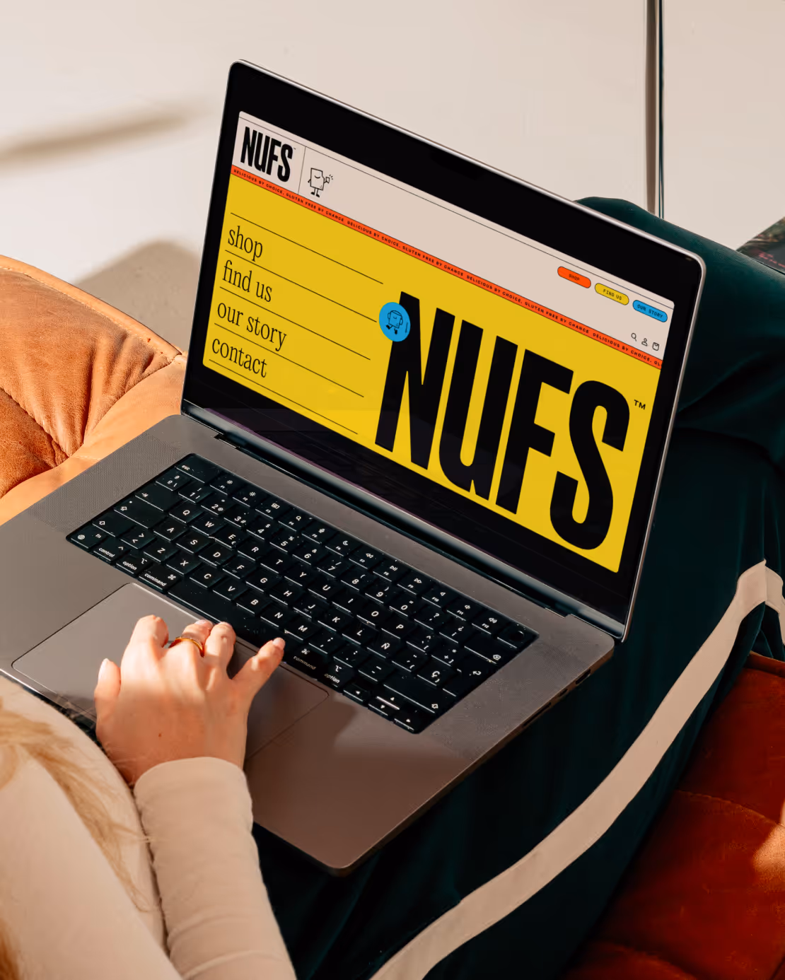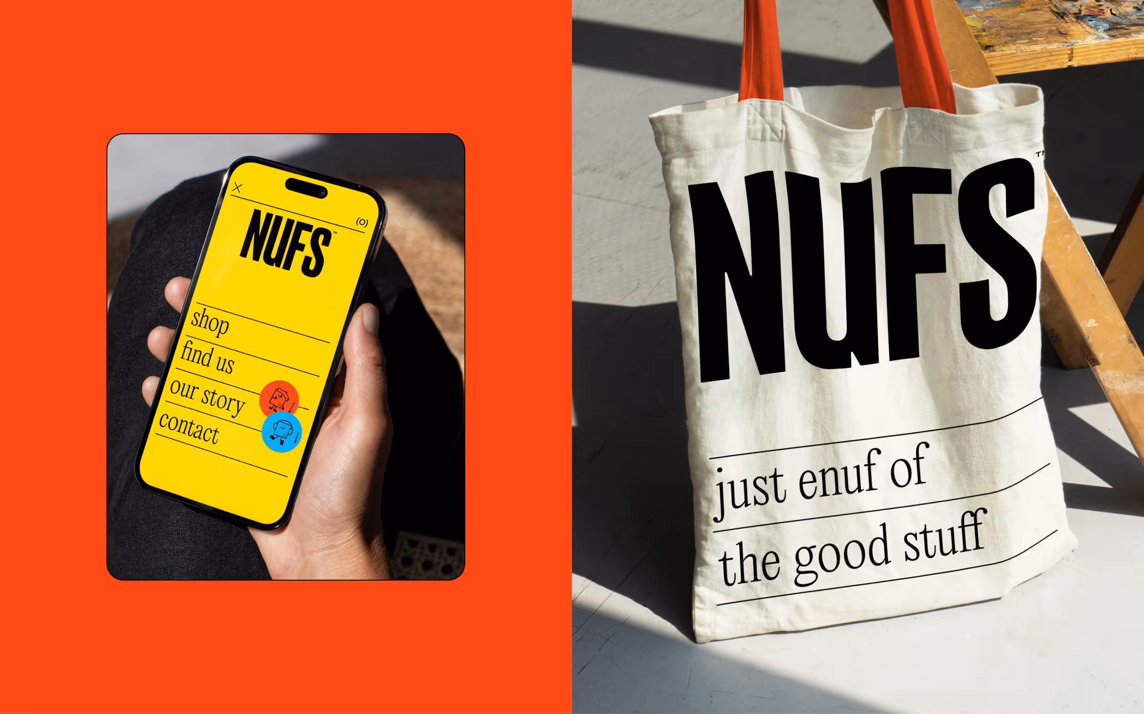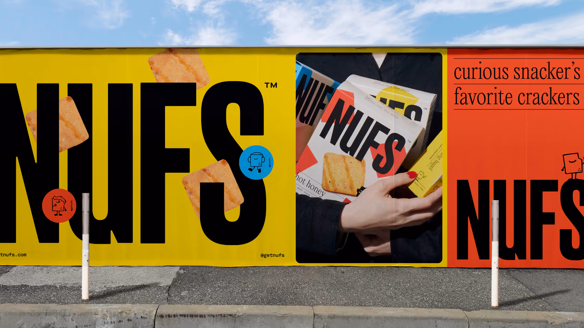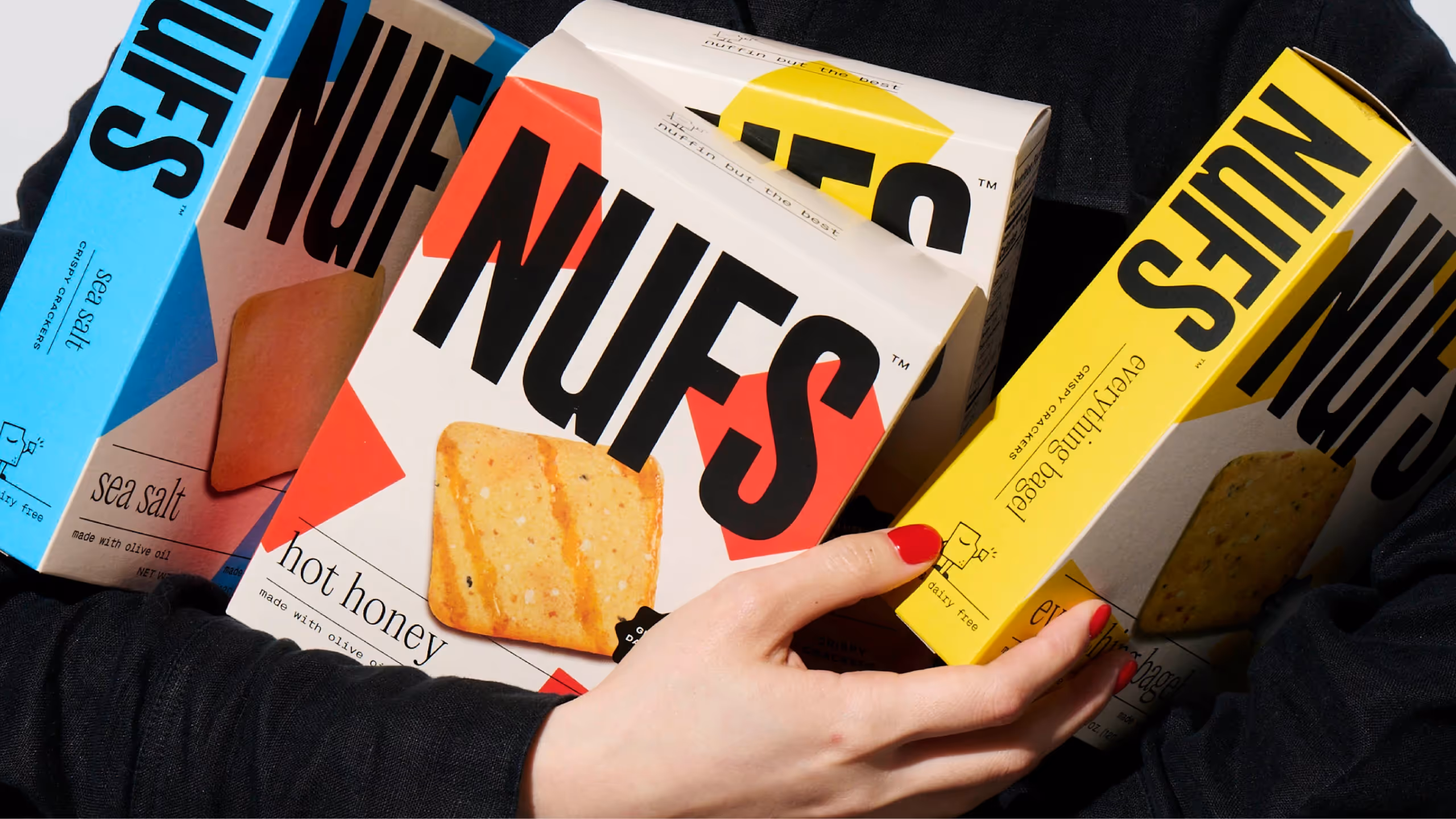
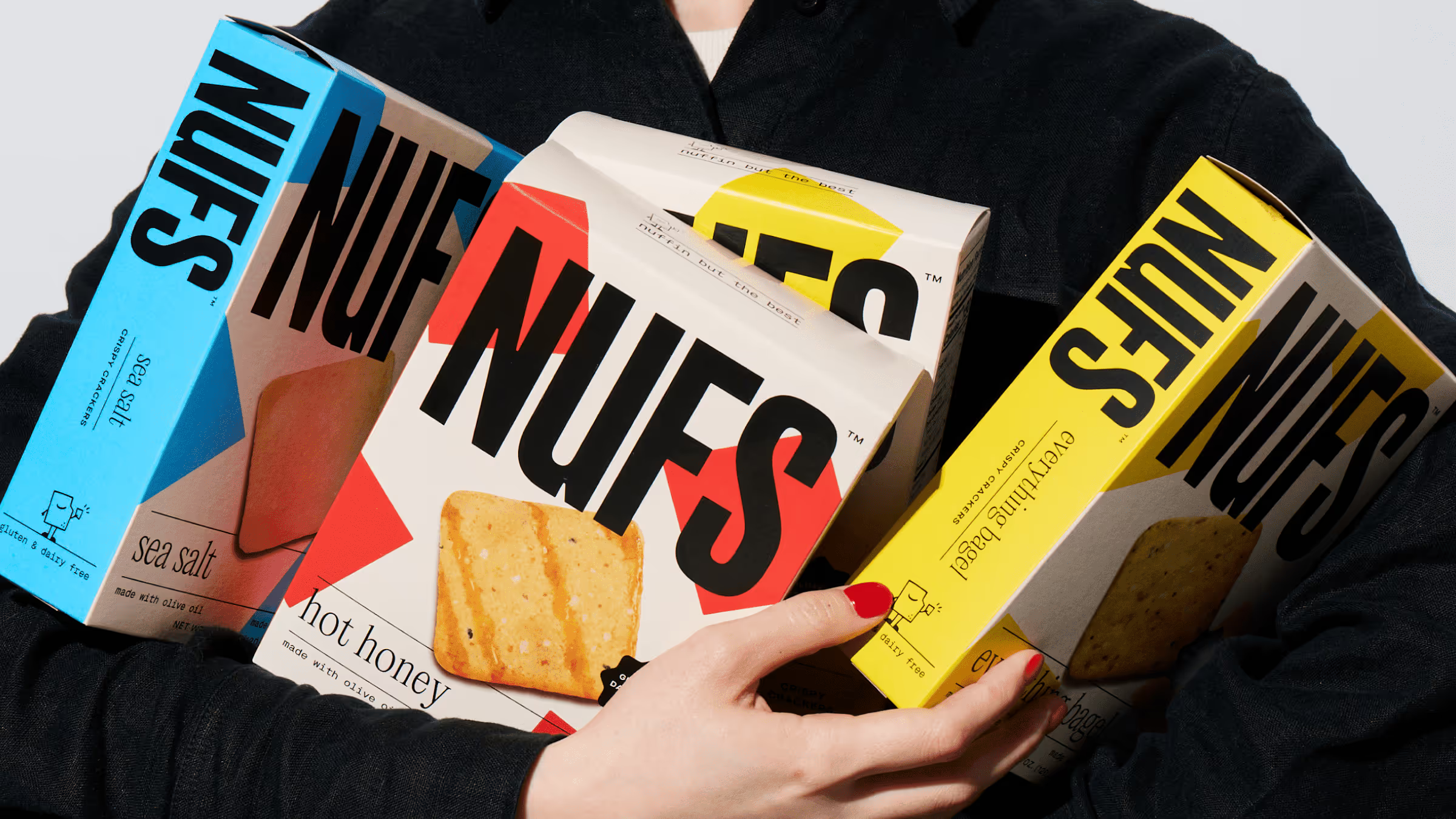
NUFS
Crafting a bold graphic language to breathe life into a mostly black-and-white cracker aisle.
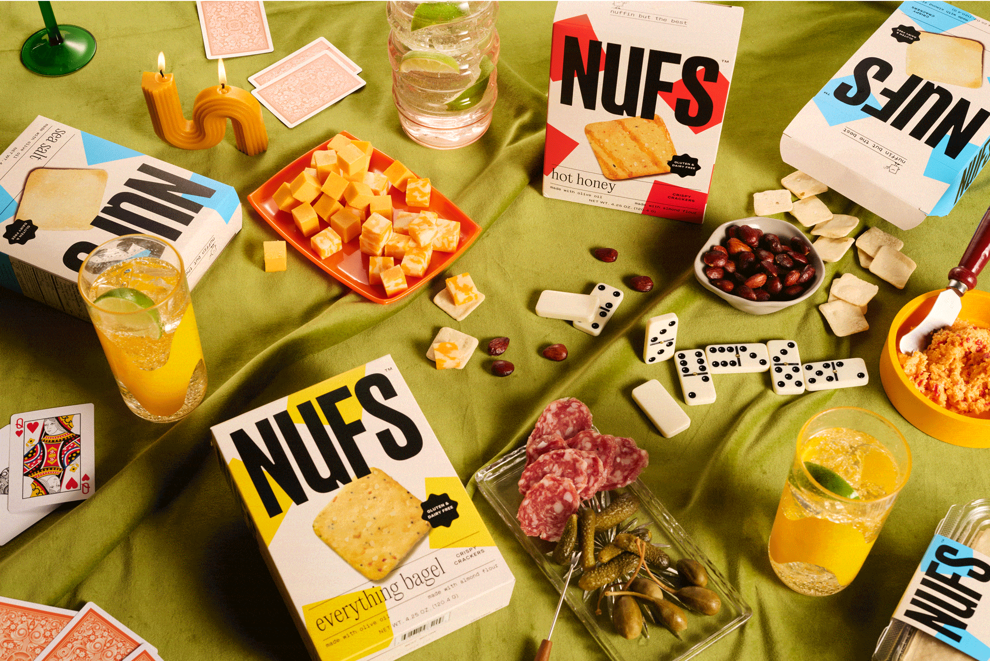
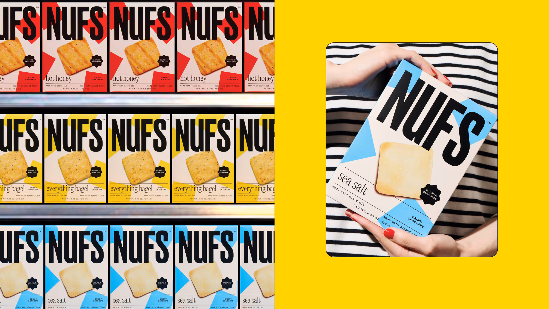
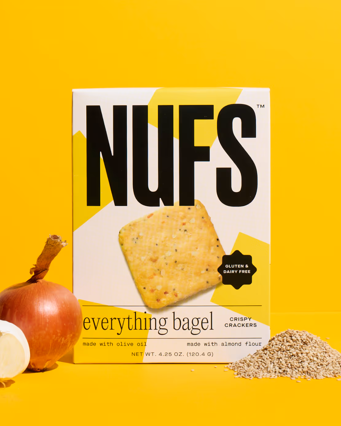
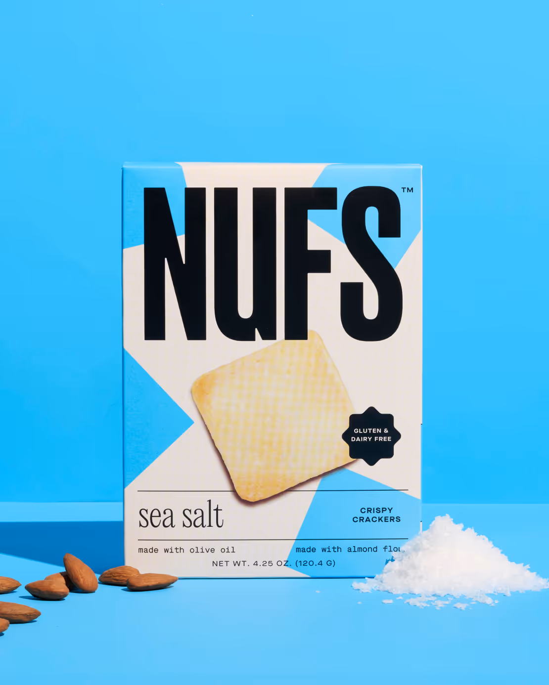
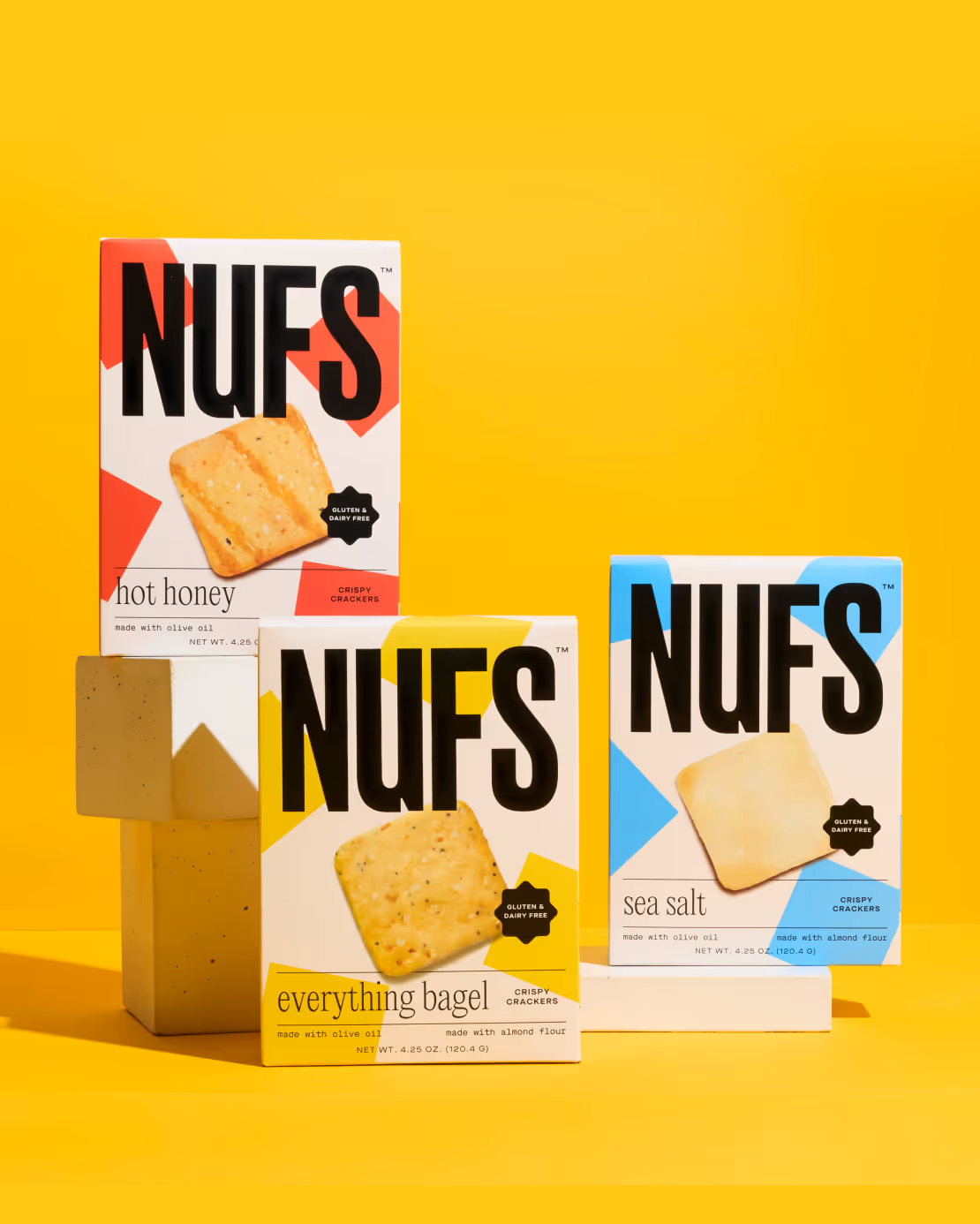
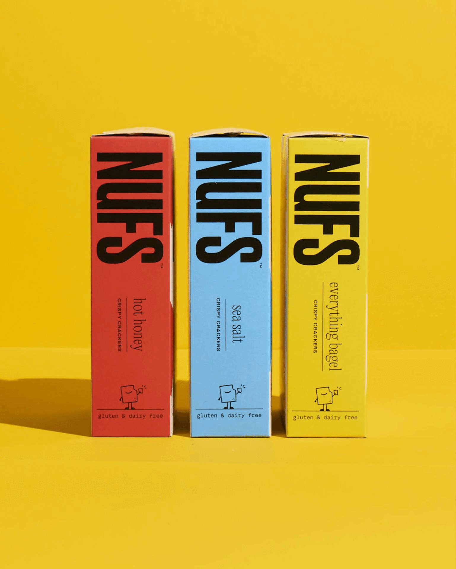
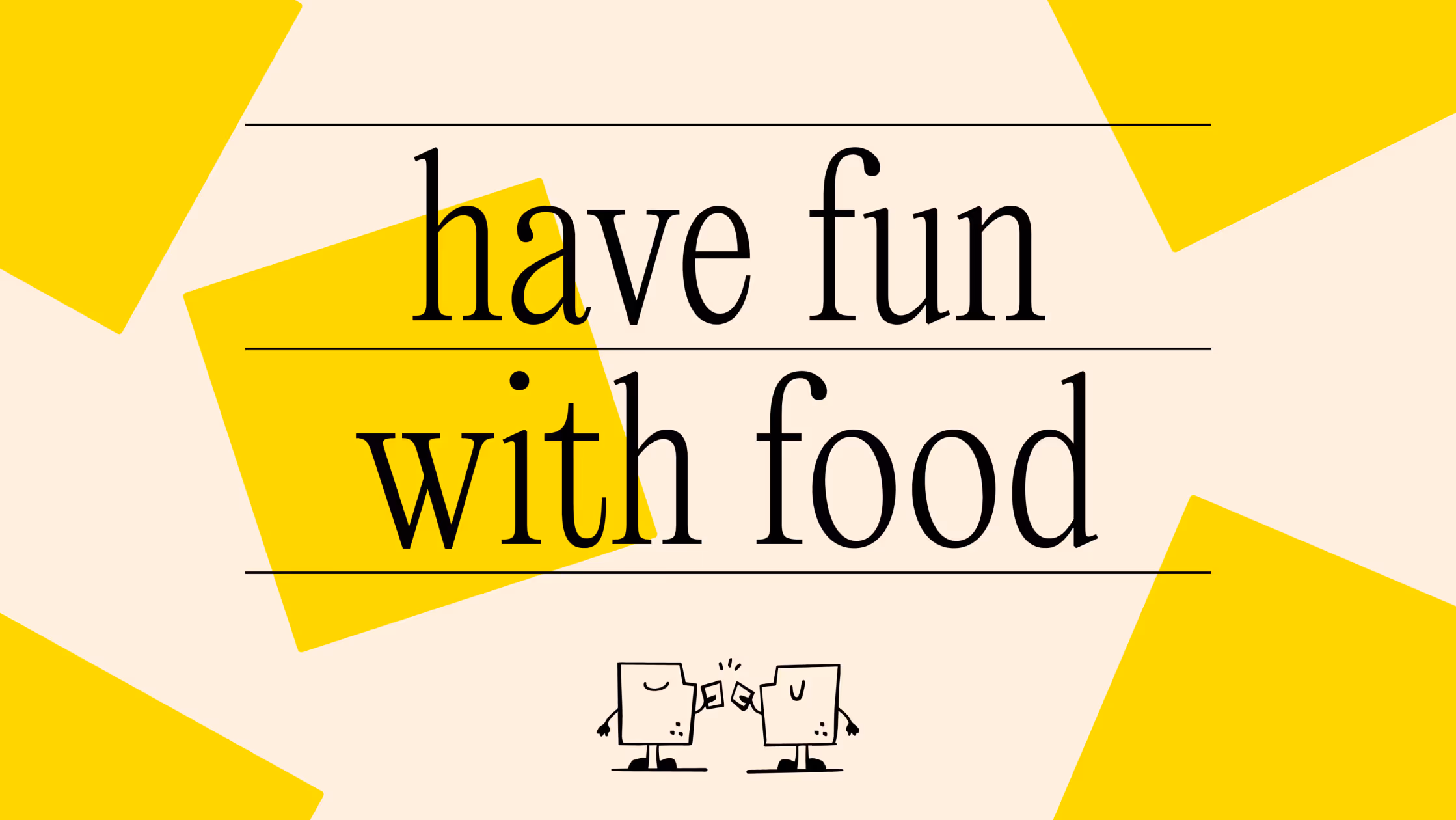
NUFS is a healthy snack brand founded by sisters after their dad was diagnosed with diabetes. They struggled to find clean, low-sugar, filling snacks that tasted good. Our challenge was to balance the clean and healthy ingredient profile with the delicious taste and fun of the snack occasion. Our goal was to establish an ownable brand and packaging system that lived up to the NUFS purpose: Have fun with food.
What We Did:
Campaign Strategy
Art Direction
Digital Asset Development
Event Design
Photo and Video Production

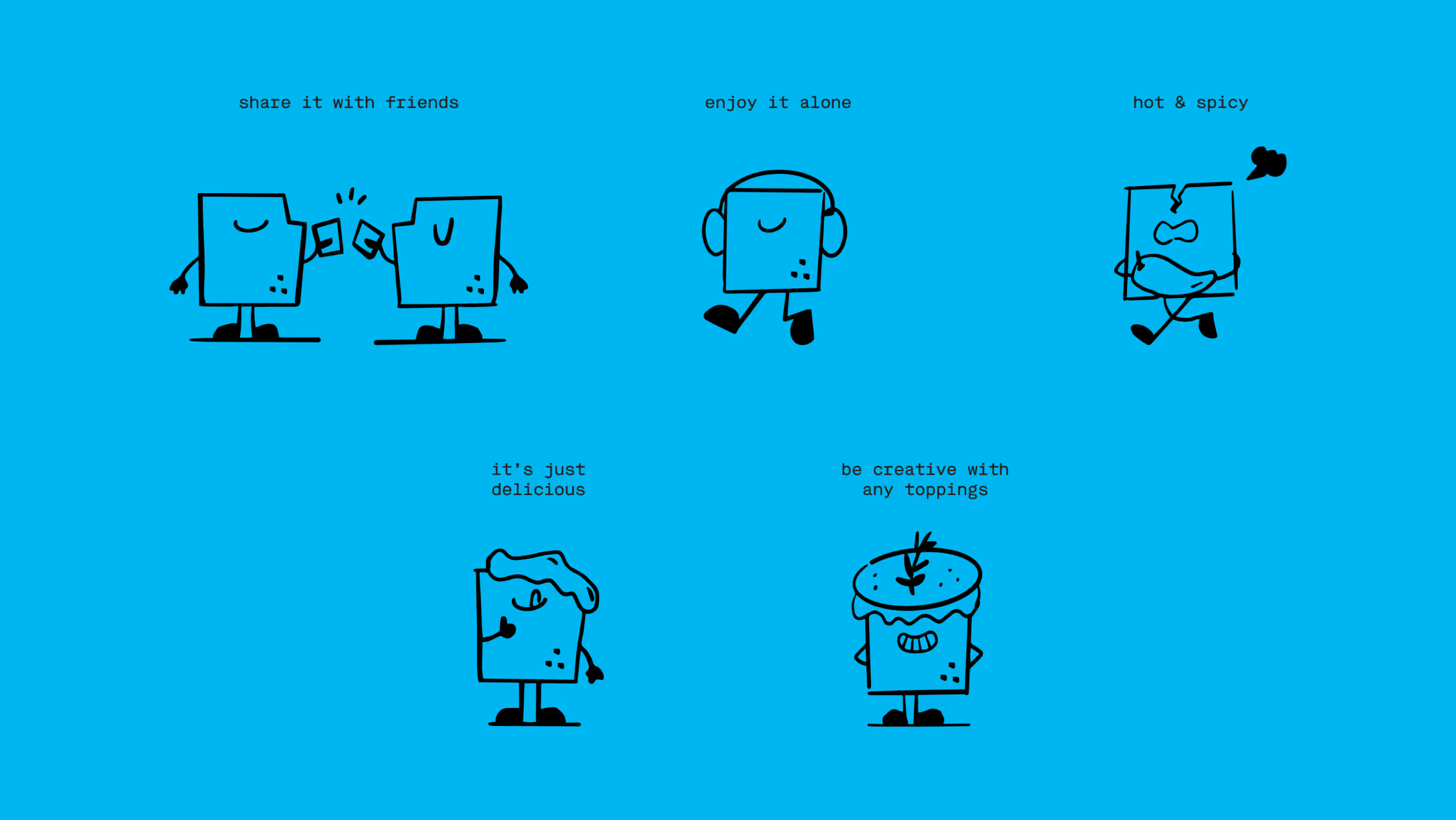
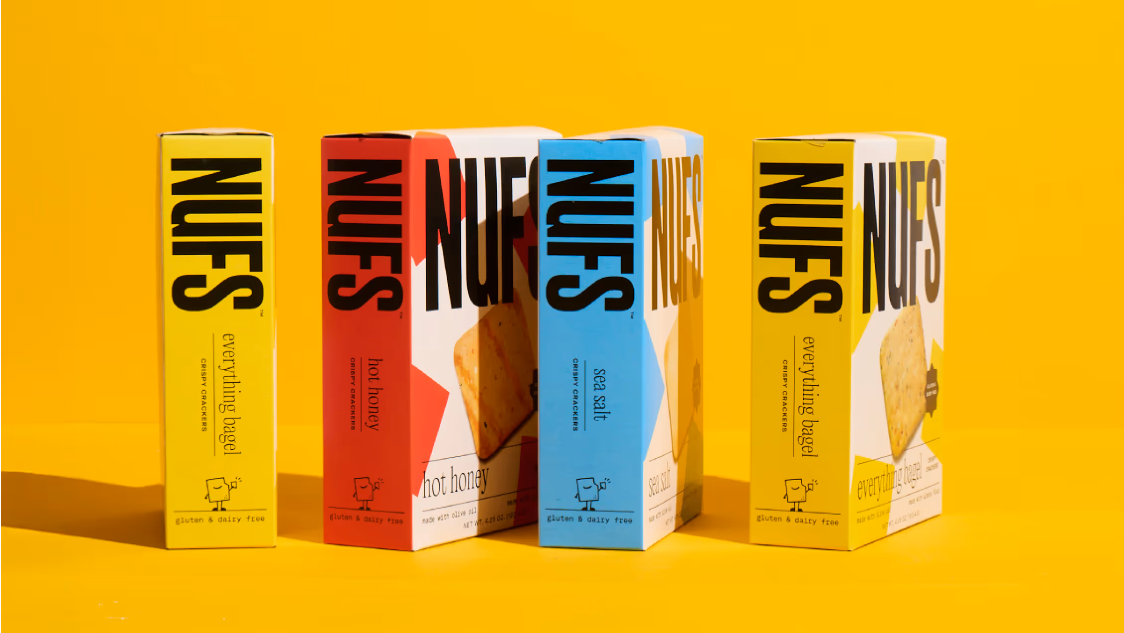
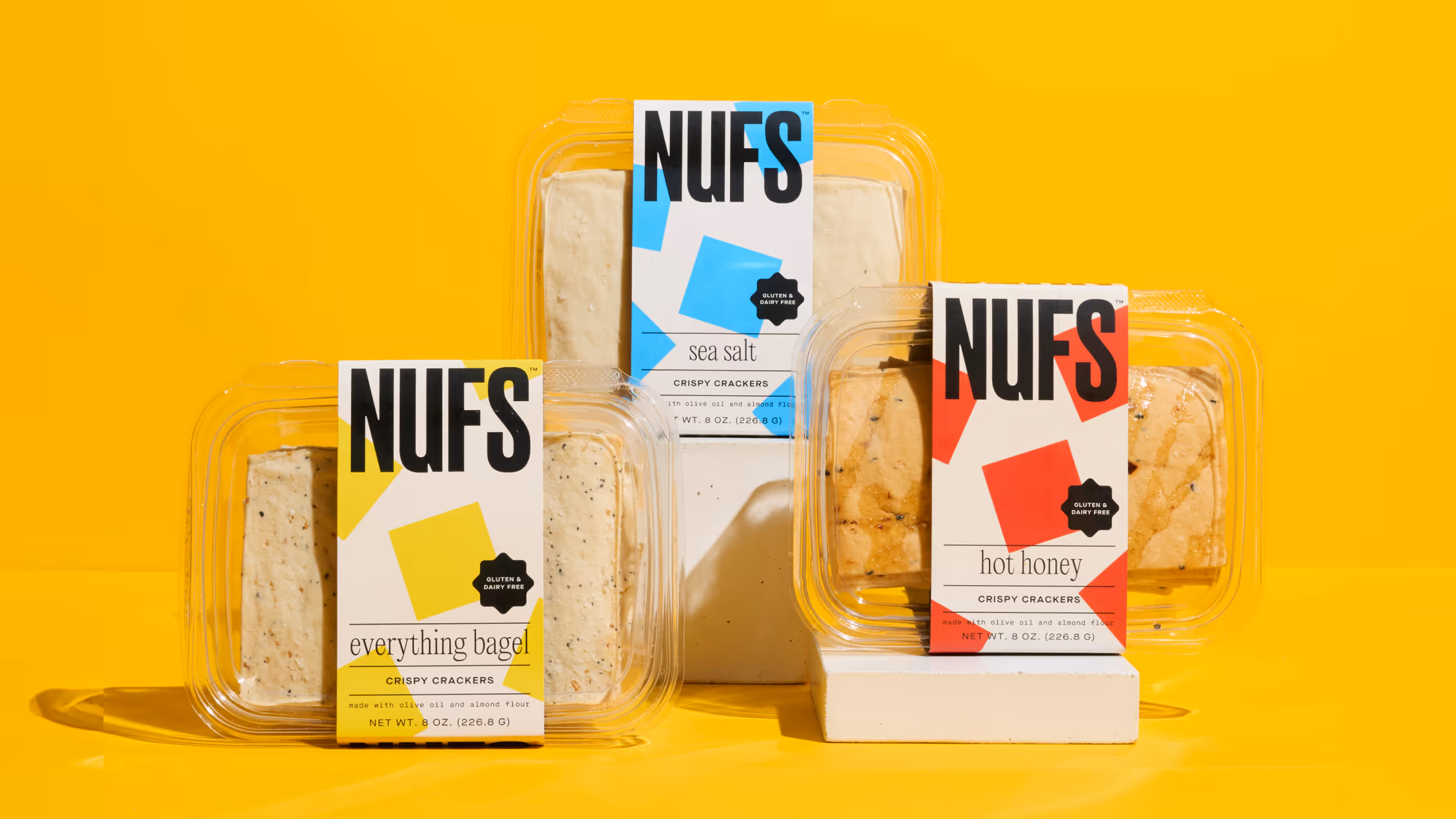
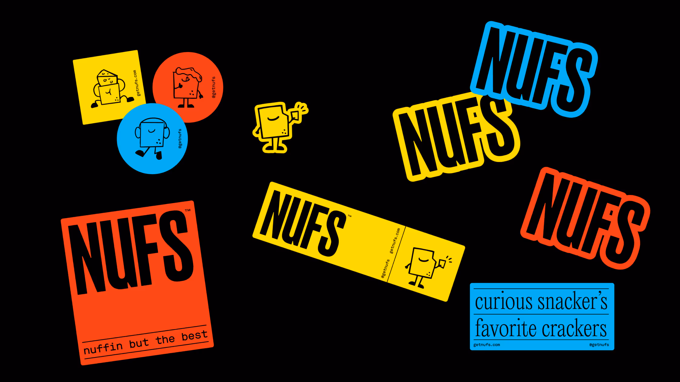
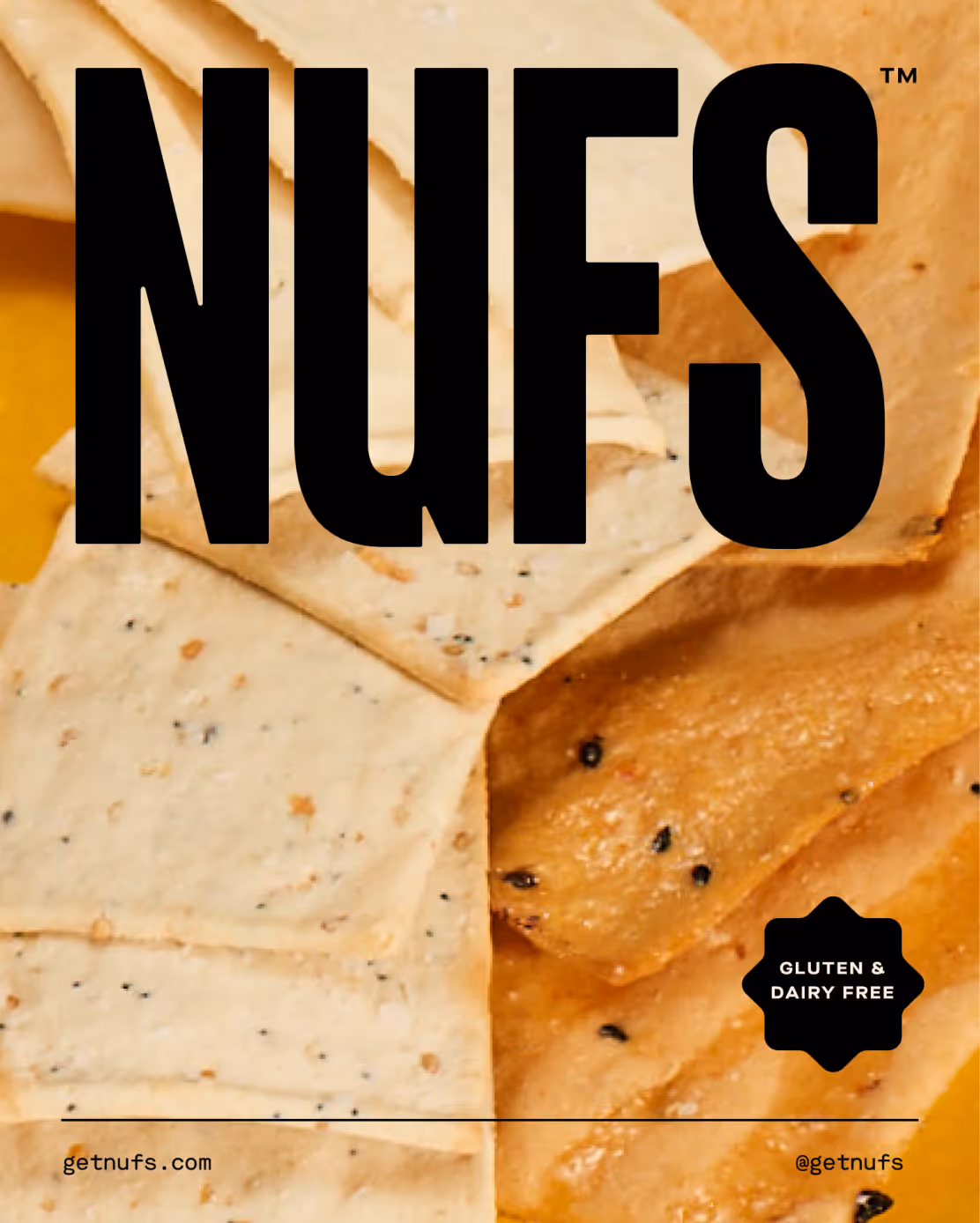
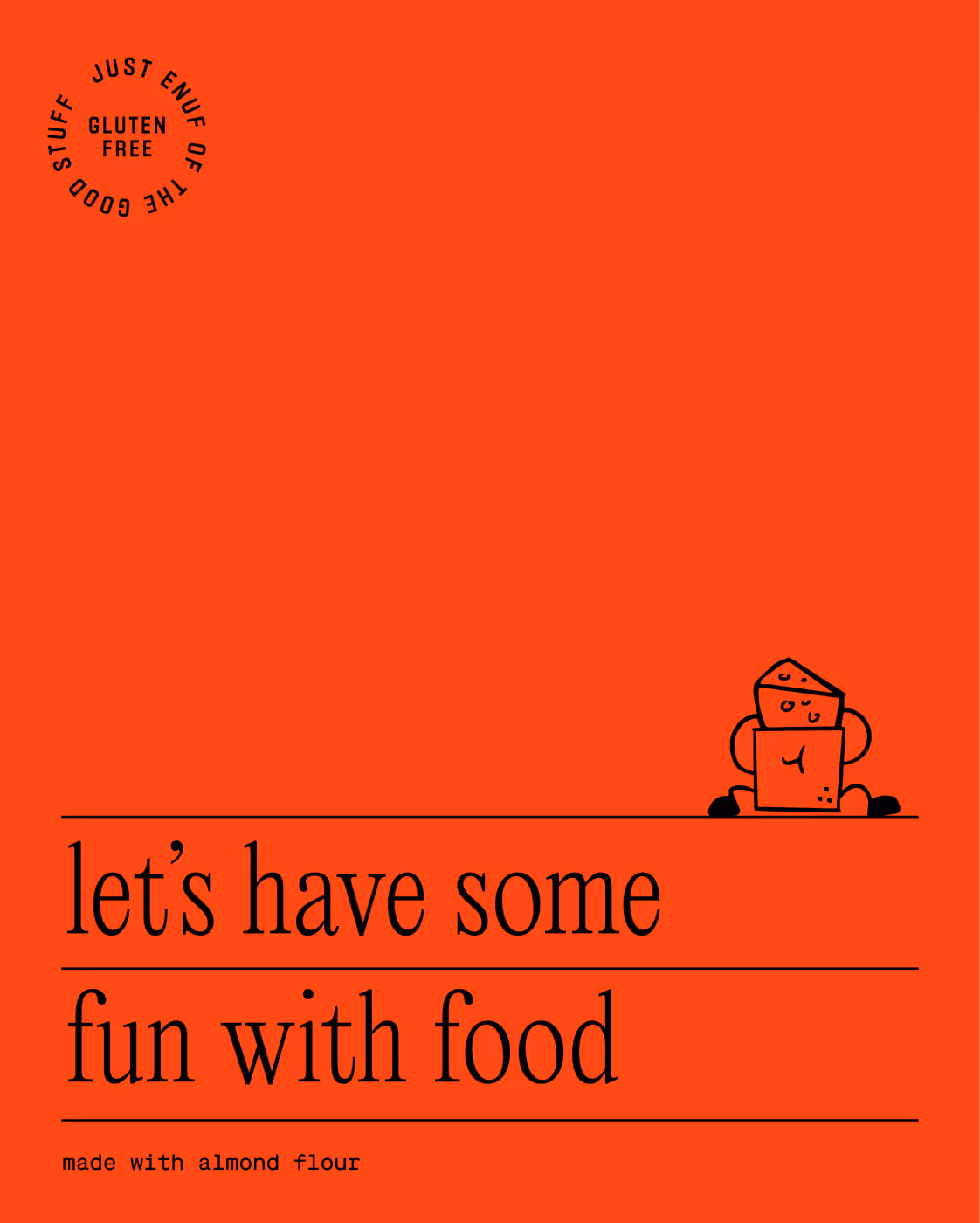
Our expansive brand system includes graphic representations of the products, a bold yet legible wordmark, a personality-packed mascot and an organic-feeling illustration style.