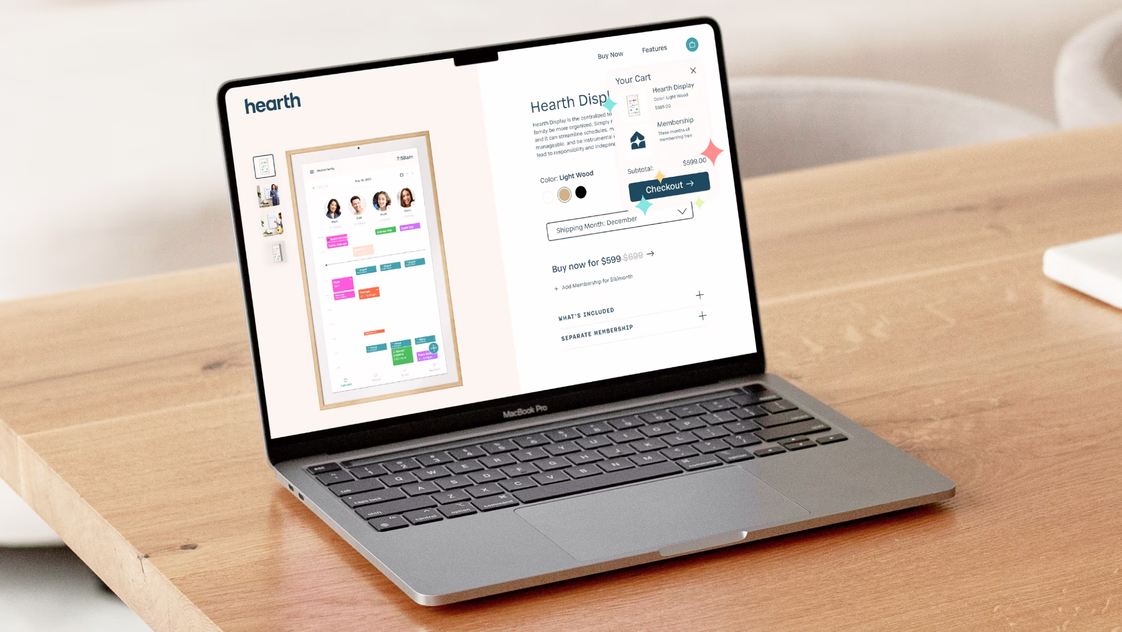
Hearth
Developing a brand that makes family organization an easier, shared responsibility for everyone in your home.
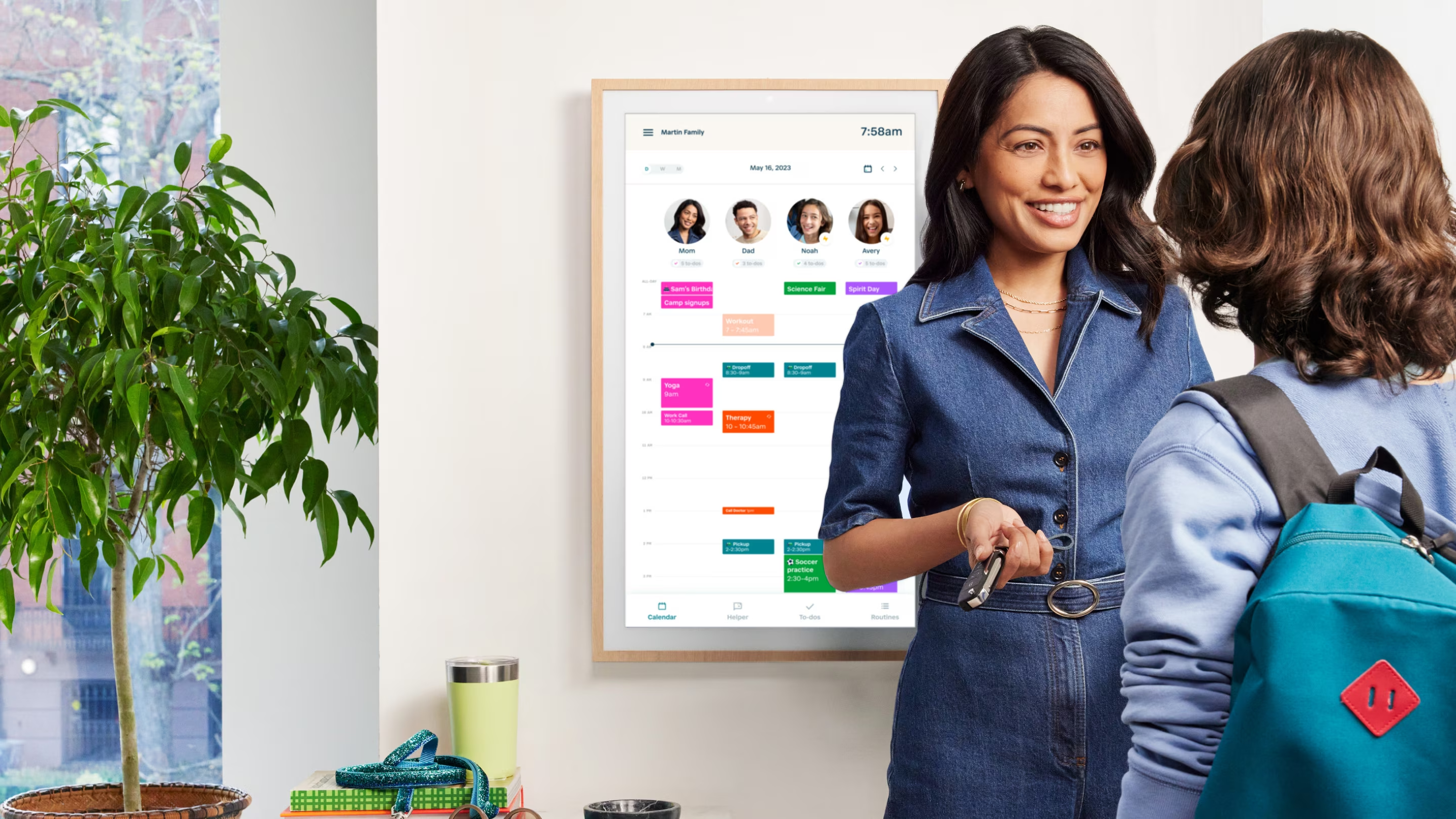
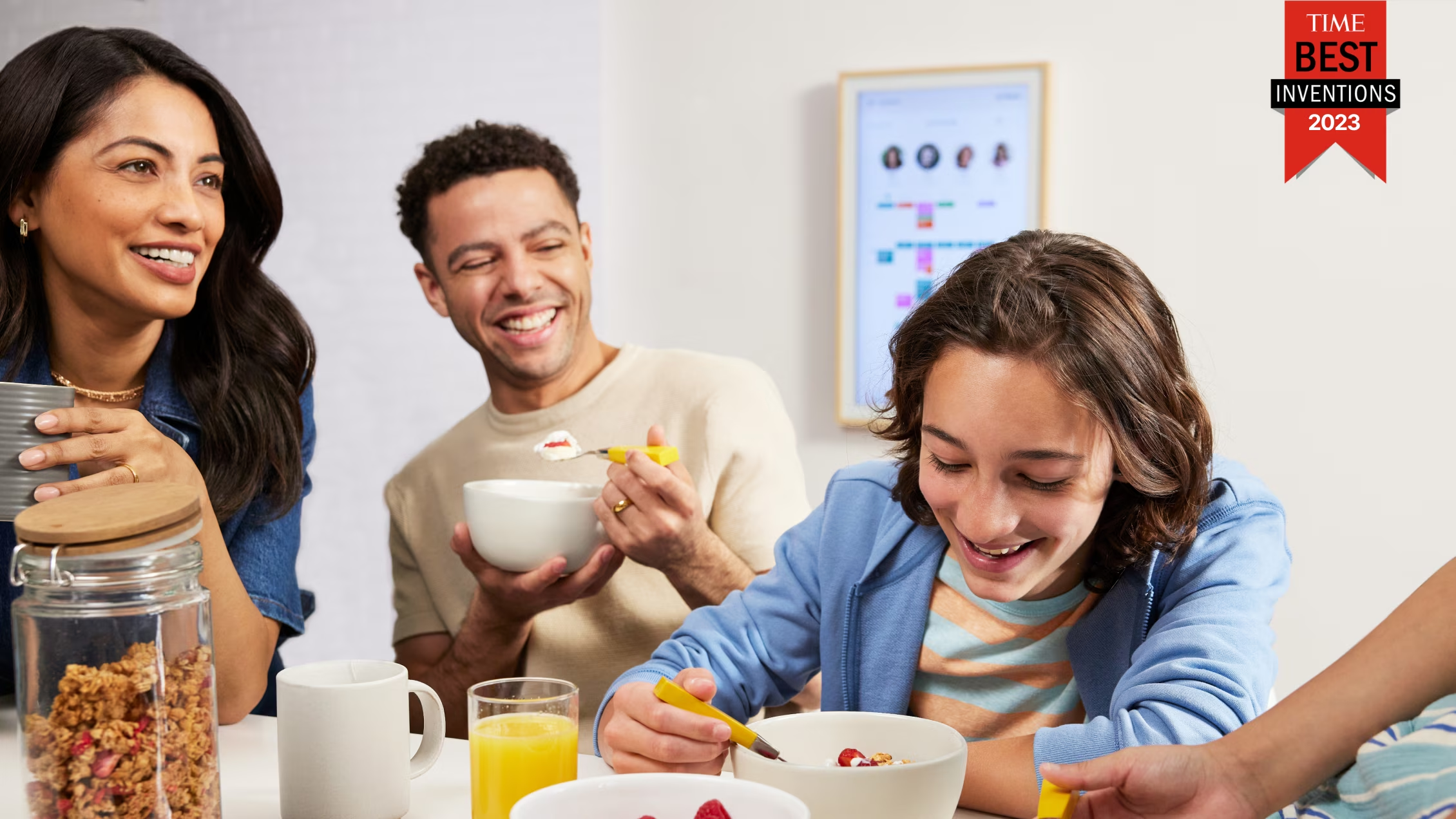
Hearth is on a mission to help households focus their precious time on meaningful, positive interactions. Their technology makes juggling goals and responsibilities feel miraculously effortless. TWA partnered with Hearth to collaboratively develop their entire brand, from strategy to web design, to be as magical as the product itself. While Hearth is on their third sold-out product drop, make sure to join their waitlist!
What We Did:
The rebrand of Hearth was built on the mantra, “More magical moments.” TWA developed a system that is warm, vibrant and mystical. The logo itself models the shape of a house with a twinkle that plays out across the system.
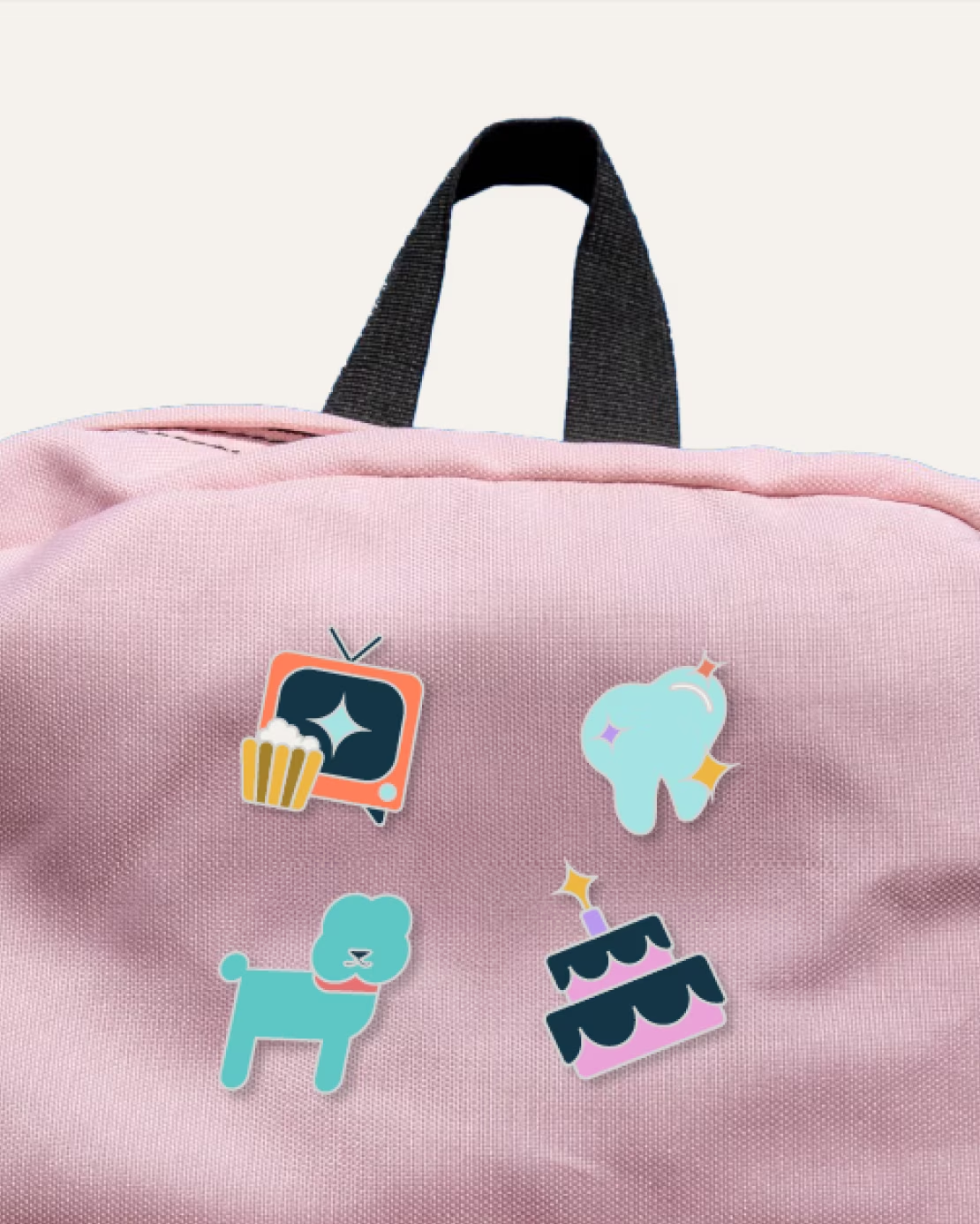
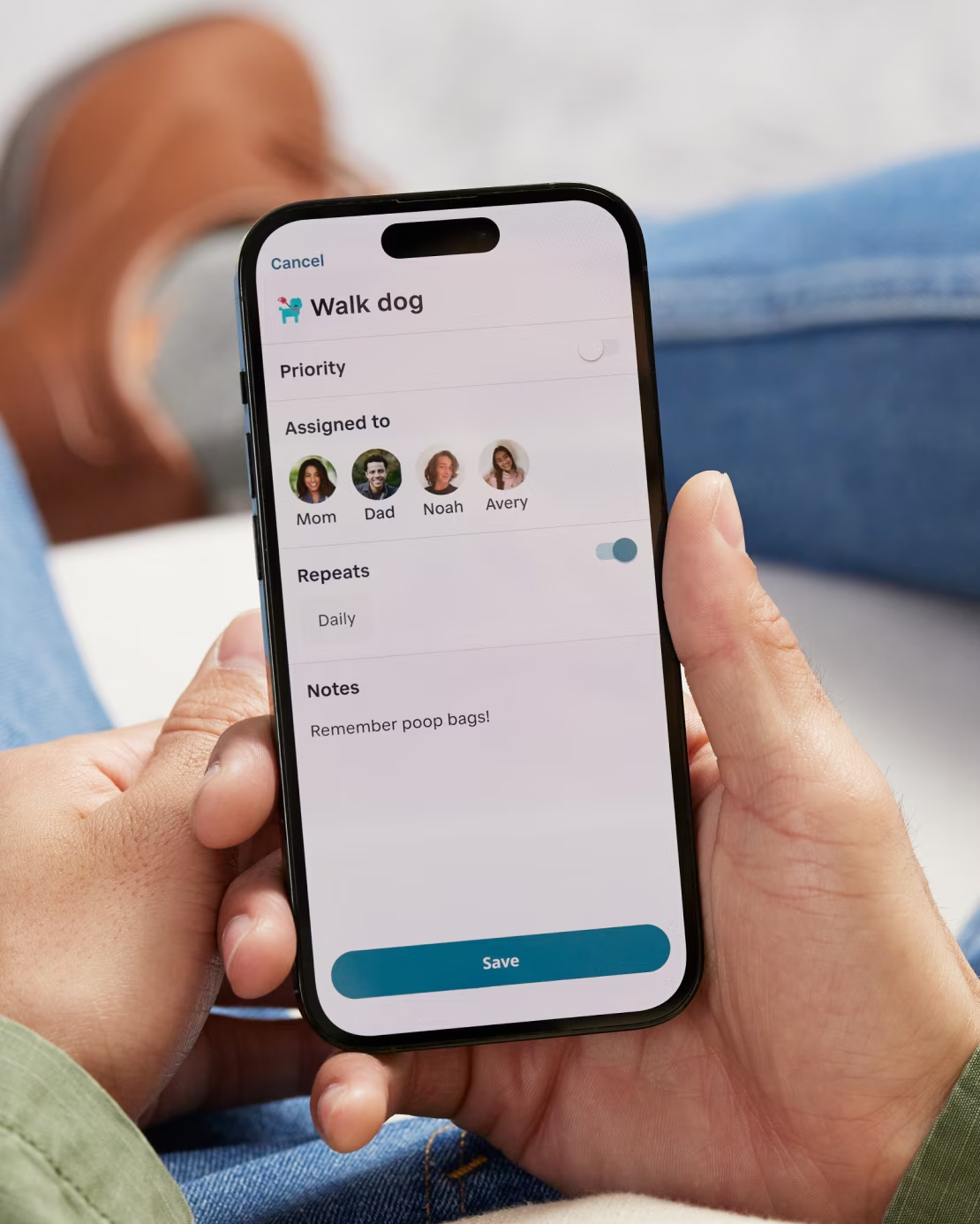
Iconography and copy is both playful and purposeful, ensuring the task list is clear and also encouraging. Motion is used throughout the system, adding to the magic through movement.
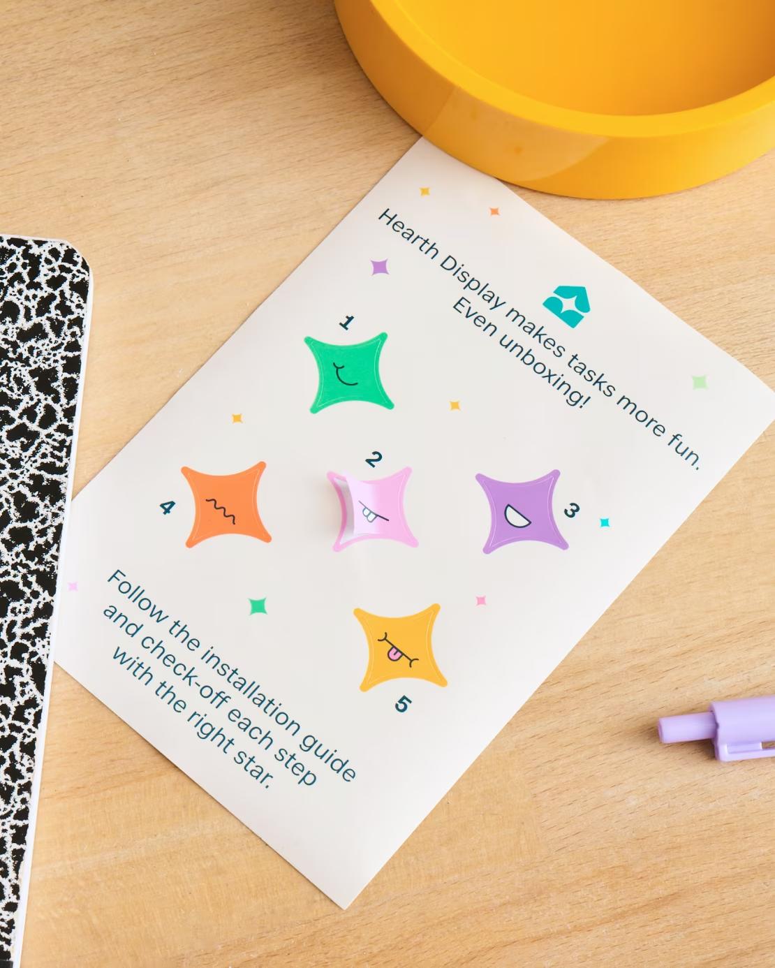
Three abstract home shapes are used as a graphic device across the system as image containers. These containers can be stretched horizontally and vertically or flipped to accommodate different compositions.